One of the most important parts of running a restaurant is branding. In this post, I’ve collected some of the best restaurant branding and design examples for your inspiration.
The examples span across the globe and include several categories like Asian, Italian, fast food, seafood restaurants, and more.
When it comes to restaurant branding, you need to think about more than creating a menu, logo, and some posters for the walls. Branding is an overarching concept. It encompasses everything that your customers experience from the time they enter your establishment until they leave. The interior of your restaurant, your physical signage, and even your employee uniforms are all a part of your restaurant’s branding.
Now let’s take a look at the designs!
Table of Contents:
Asian Restaurant Branding
Cool Restaurant Design
Fast Food & Street Food Branding
French Restaurant Brand Examples
Indian Restaurant Branding Ideas
Italian Restaurant Design Examples
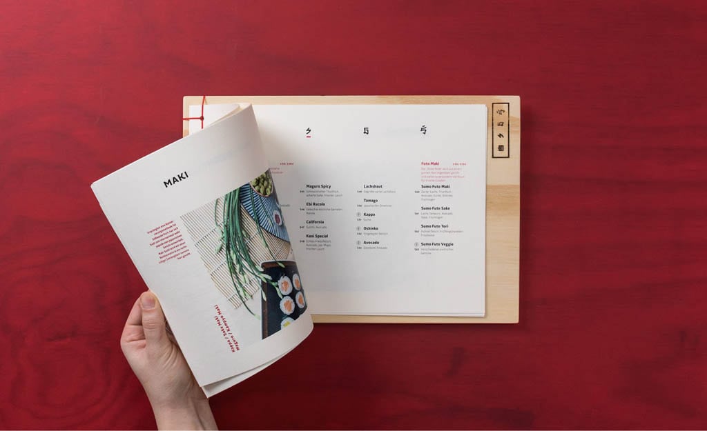
Japanese Restaurant Branding & Design
Mexican Restaurant Branding
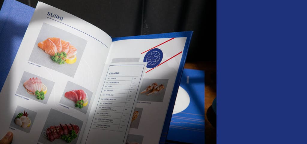
Seafood Restaurant Design
Asian Restaurant Branding
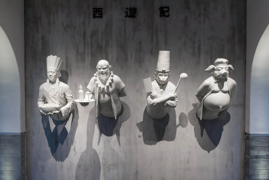
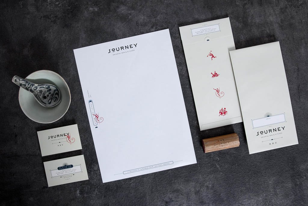
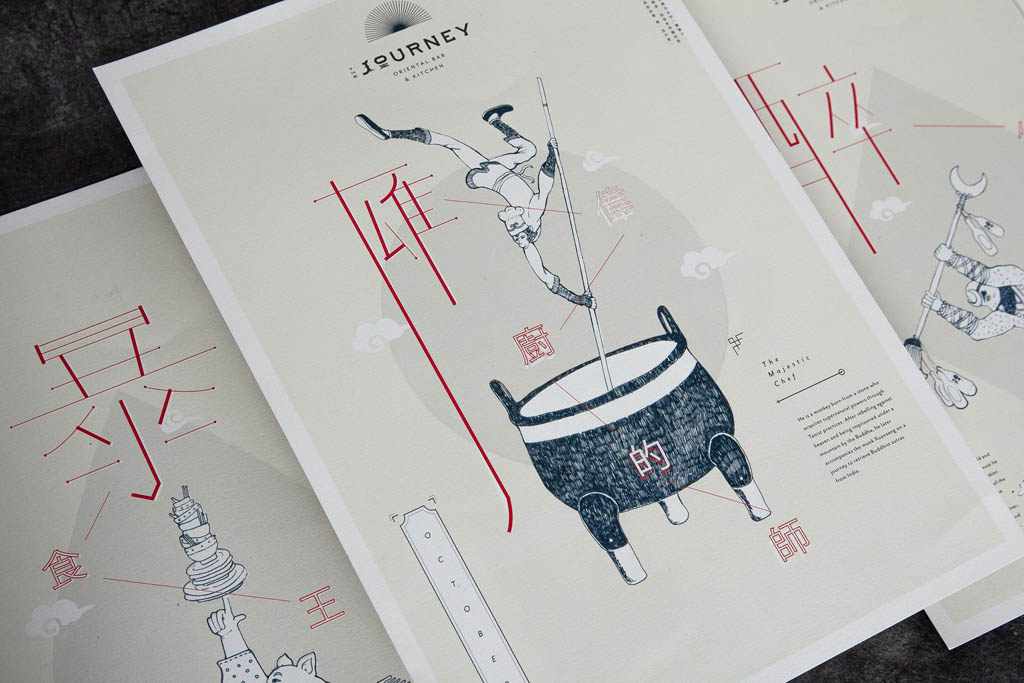
Journey Oriental Kitchen & Bar
Journey is a Chinese Restaurant in Indonesia. The branding & design is by Thinking Room.
The name, Journey, is derived from one of the great classical novels of Chinese literature, Journey to The West. The J and O in the logotype is composed from Chinese letters for journey (程). Inspired with the original story, we created a brand and concept that brings all four characters alive, as The Monkey King and his friends have stopped by the place while travelling to the west.
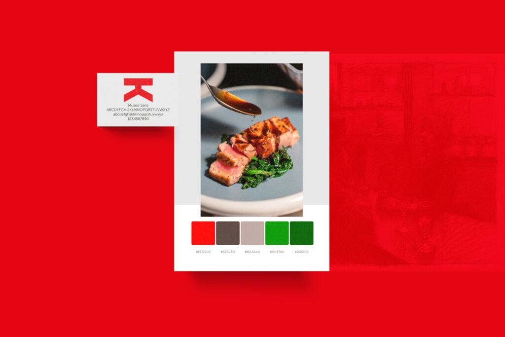
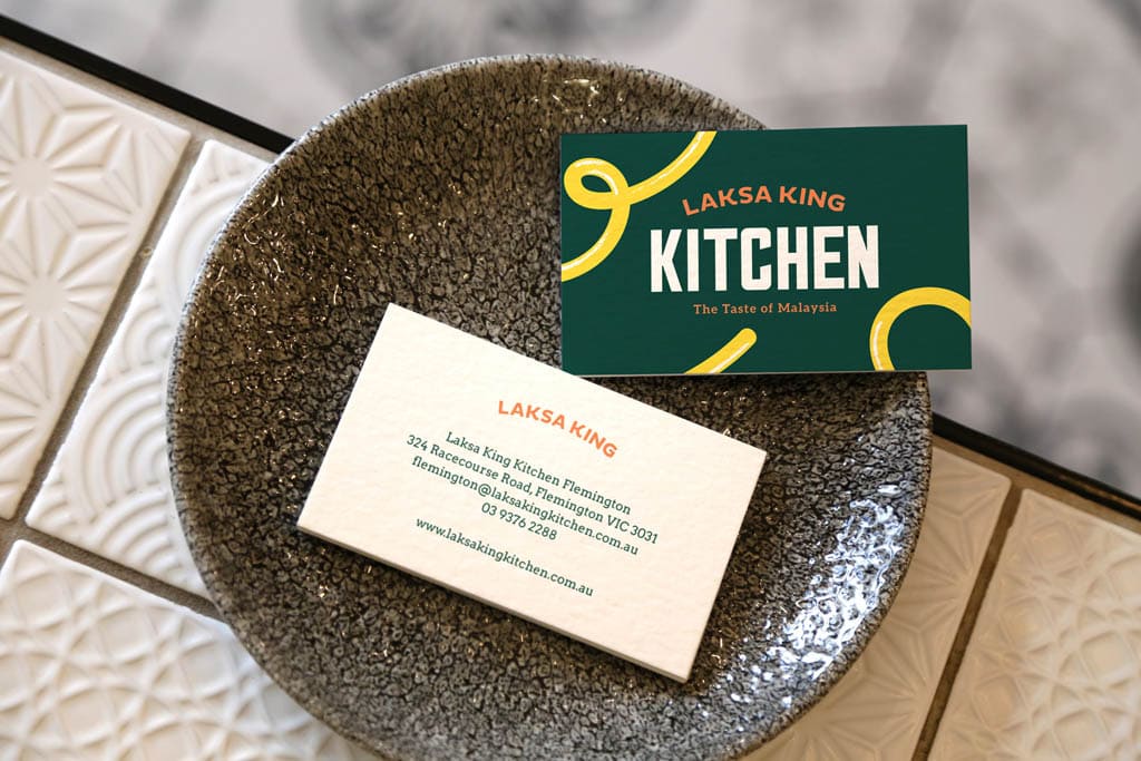
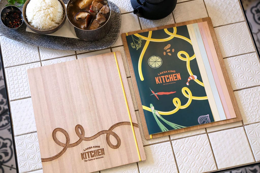
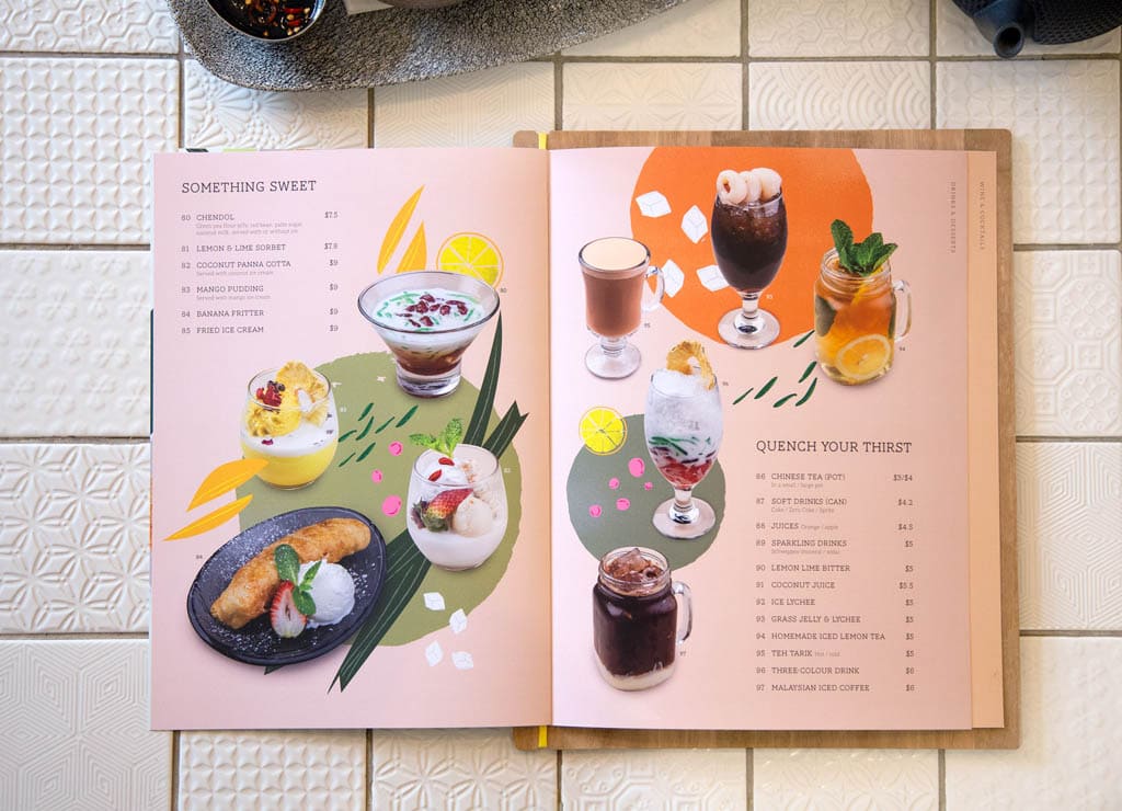
Laksa King Kitchen
We designed the brand to be youthful and bright with fun illustrations.
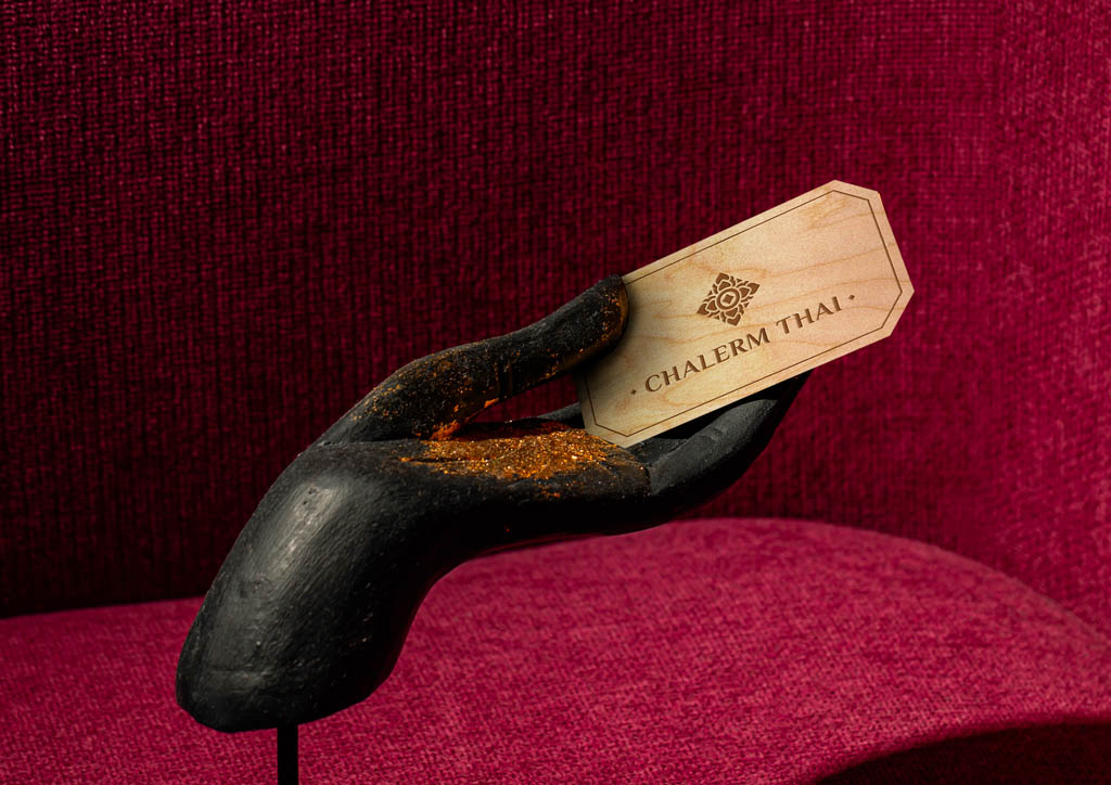
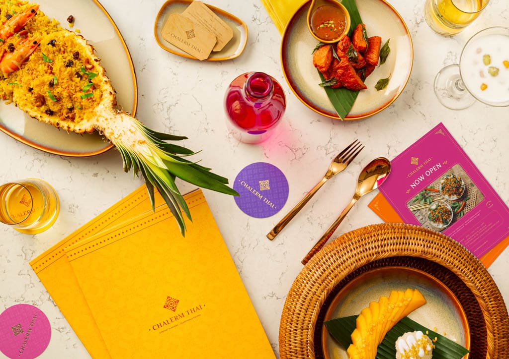
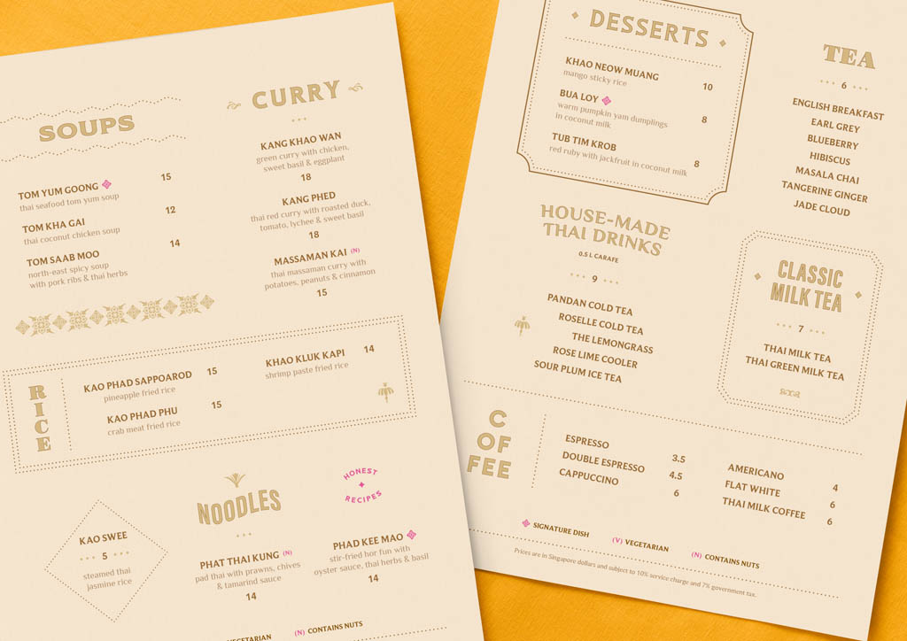
Chalerm Thai Restaurant
Serving traditional Thai dishes in a contemporary setting, Chalerm Thai looks to excite both the senses of taste and sight. From tropical sweetness to fiery spices, every meal provides a magical mystery ride for the tastebuds.
Dumpling Story
Our approach is creating a brand that tells a story on its own – taking inspiration deep from our client’s Chinese culture, we inscribed the logo from two dumplings to form a lotus leaf with nine koi fishes spread among three business cards.
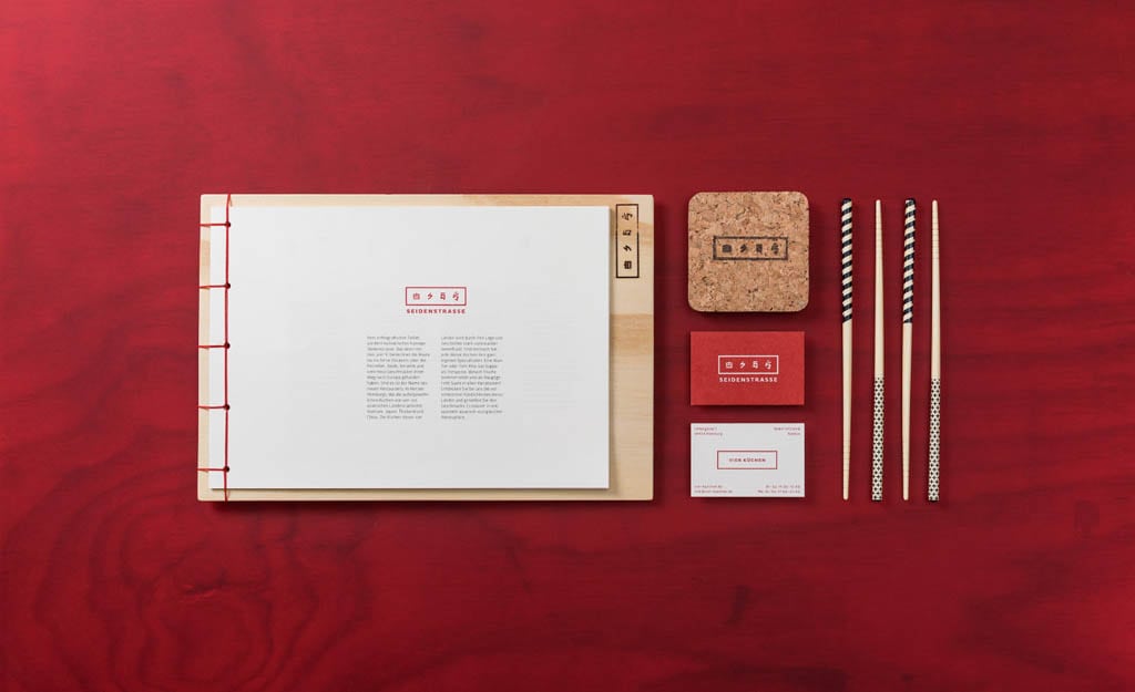
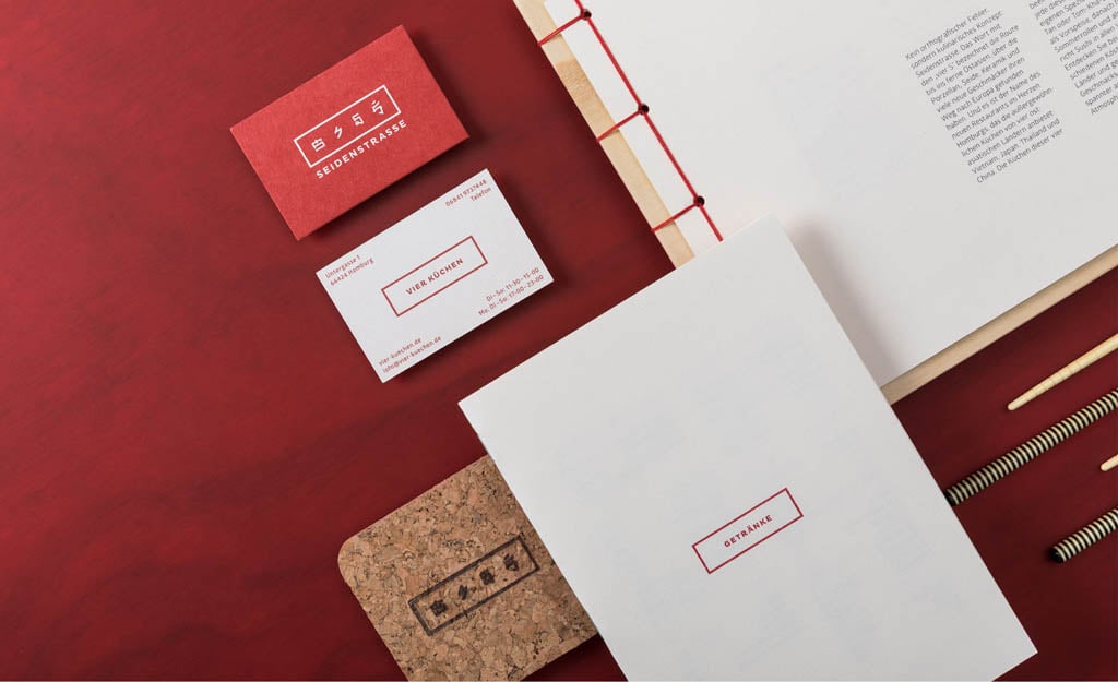
Restaurant Seidenstrasse (Silk Road)
The color red is the main part of the visual branding. The logo combines the cuisine of Vietnam, Japan, Thailand, and China. The design comes alive with clear lines, colors rich in contrast, and different materials. The earthen tones of the chairs and tables are a modern interpretation of far eastern landscapes.
Cool Restaurant Design
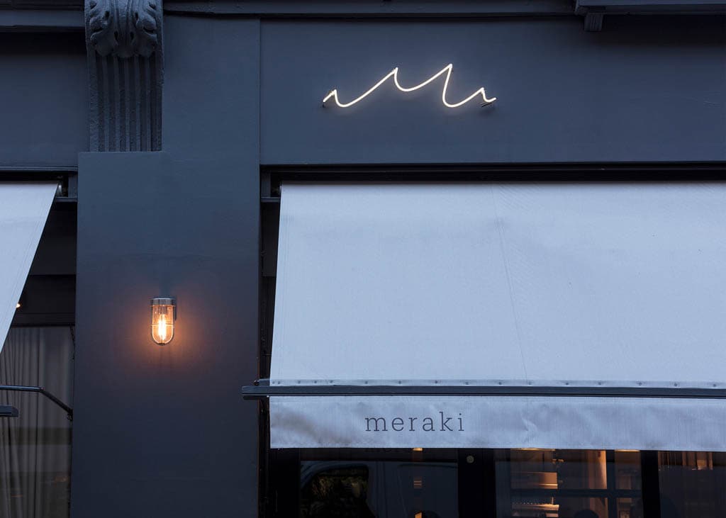
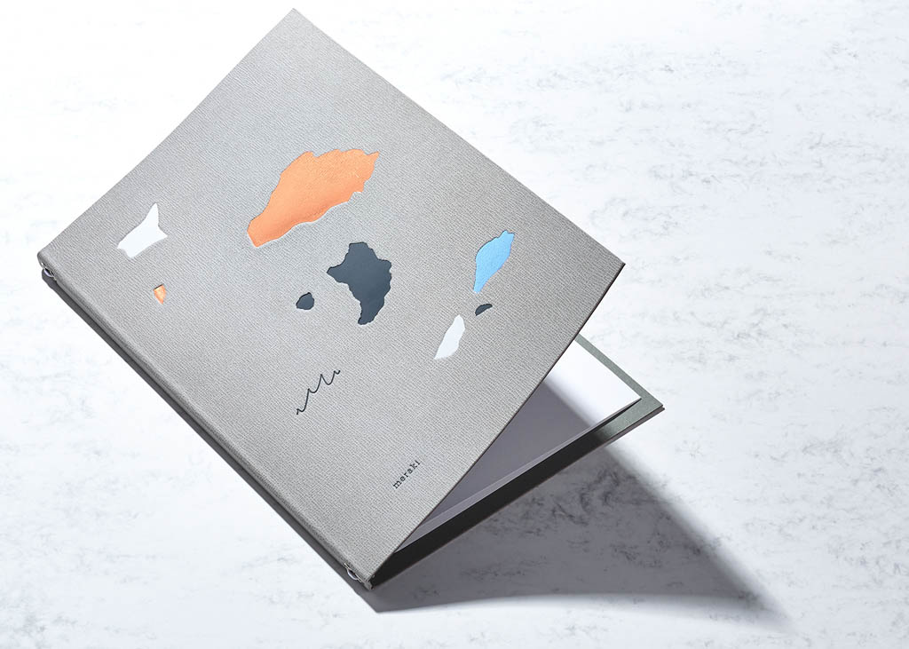
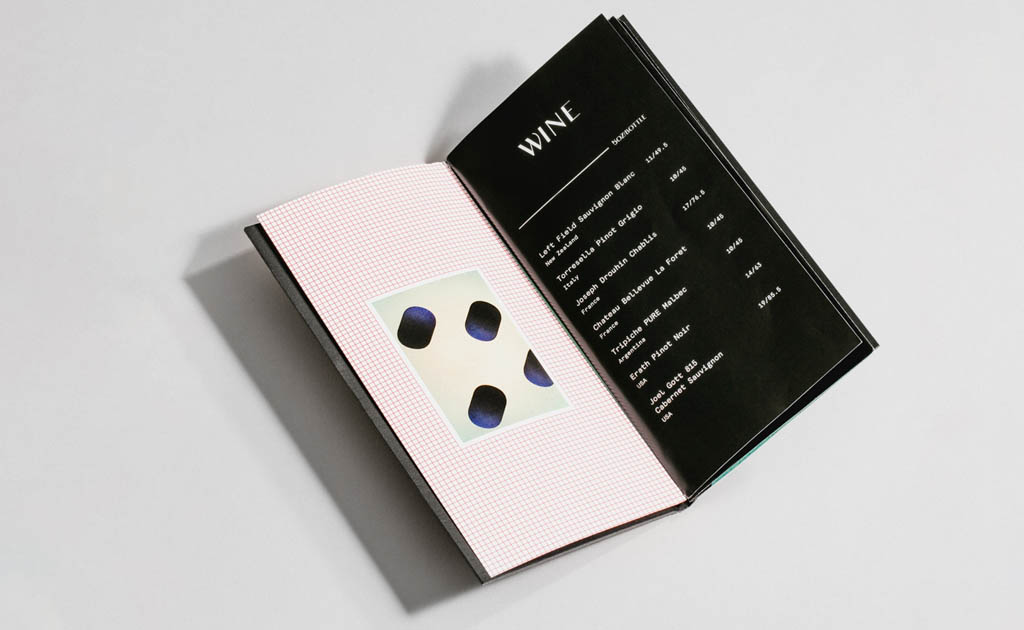
Restaurant Meraki
Meraki is a contemporary Greek restaurant in Fitzrovia, London.
There are six key island formations in Greece and this became the inspiration for the menu designs, created using a medley of finishes and textures, to subtly reflect terrazzo. Five of the formations are used on the food menus with the sixth being used on the wine menu. The M of Meraki lent itself to representing the sea and therefore works in both the context of the islands but also as a pattern in its own right. As a predominantly fish restaurant, the emphasis on the sea was important.

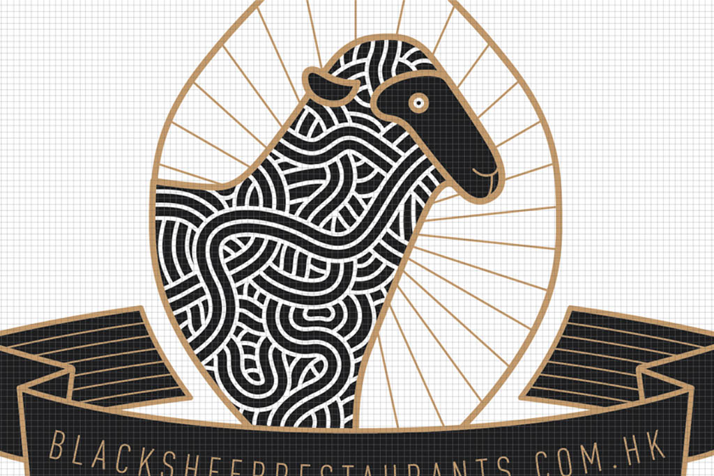
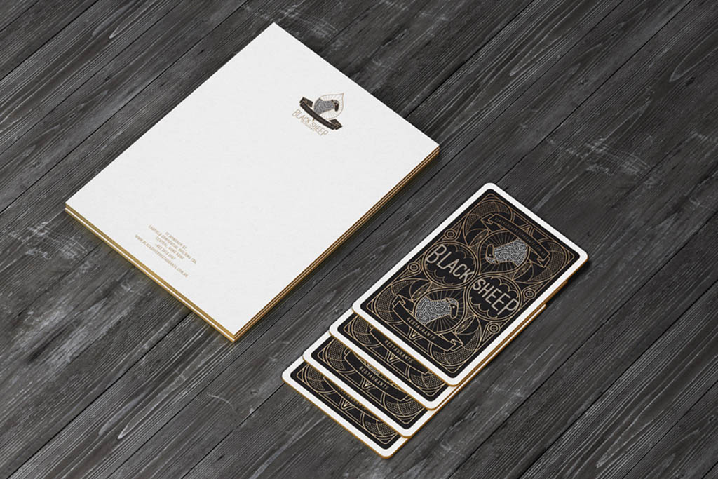
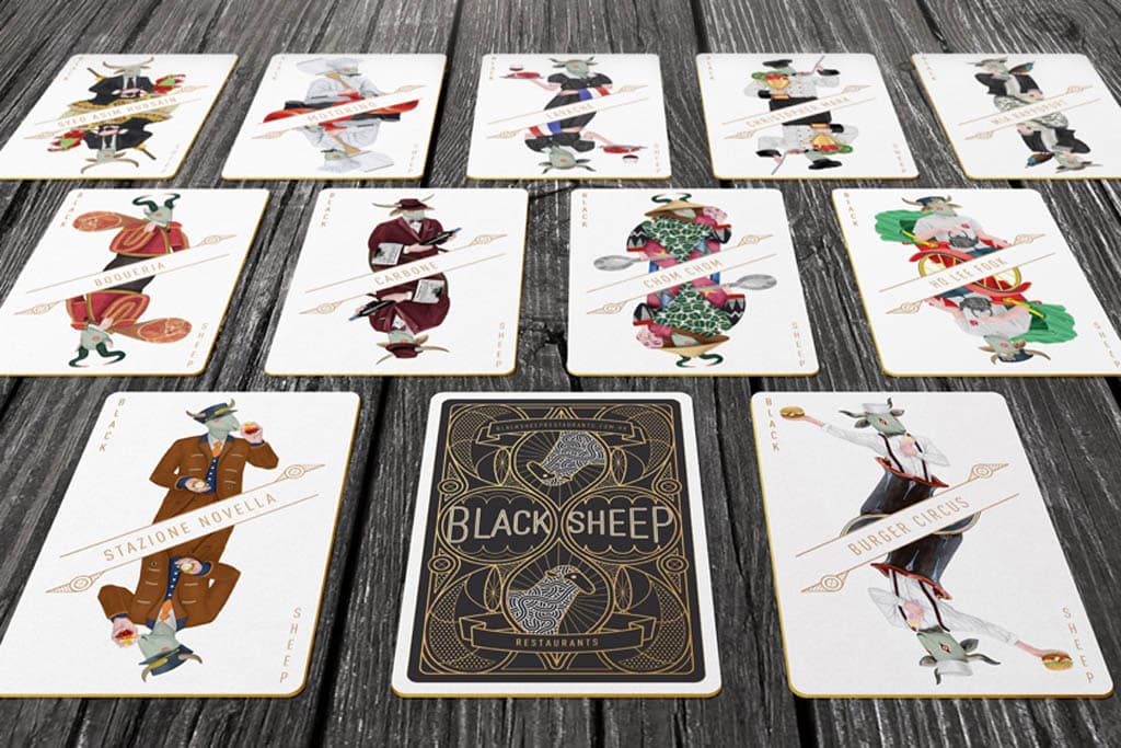
Black Sheep Restaurants
We wanted to express the personality of the brand’s legacy in creating unforgettable mementos by developing a graphic language that holds a harmony of personalities. each detail has a special characteristic and quality that makes the member integral within the family.
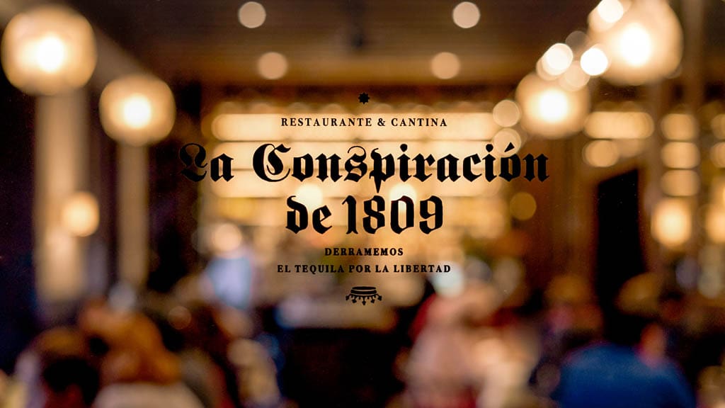
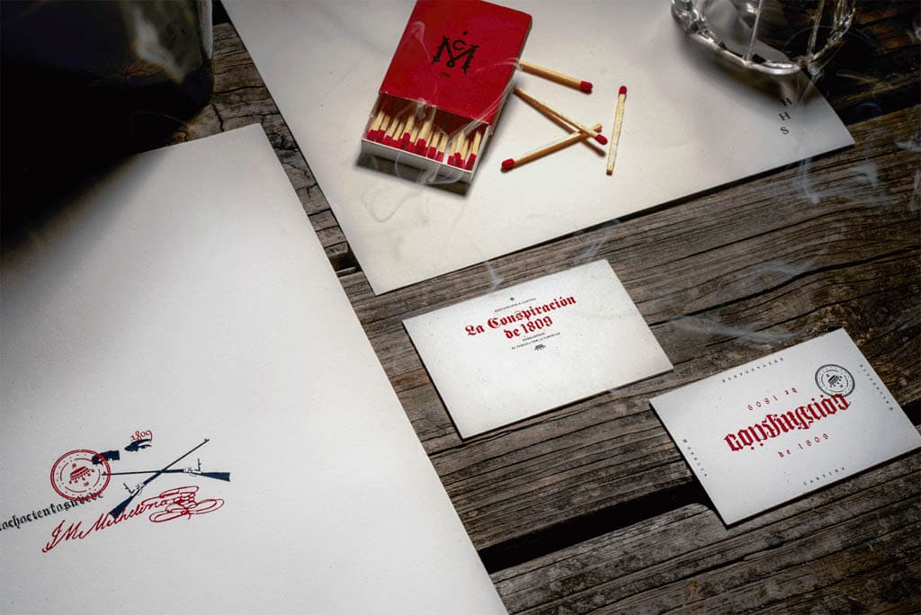
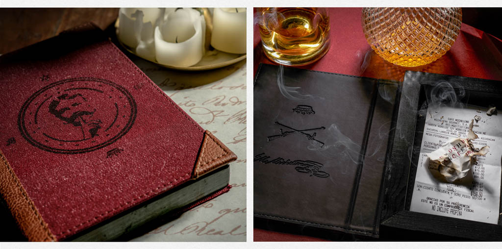
La Conspiración de 1809
La Conspiración de 1809 is a cantina that commemorates the conspiracy that preceded the Mexican Independence. A brand made for the lovers of secrecy, subversion, mystery and codes.
Fast Food & Street Food Branding
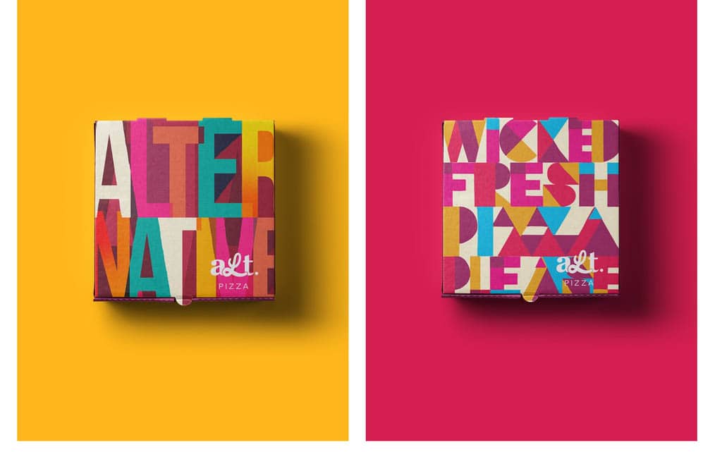
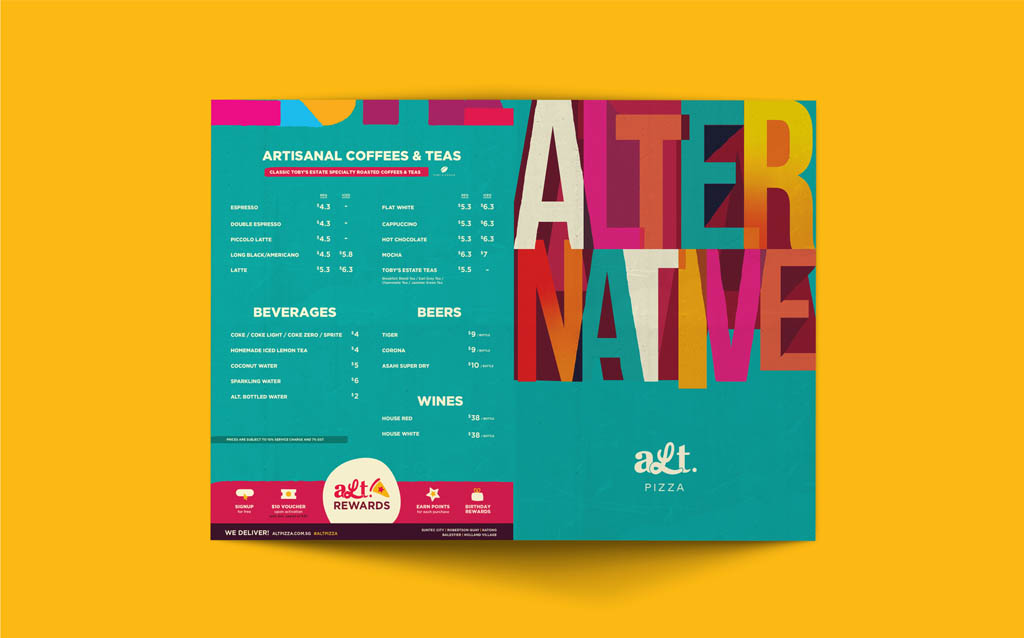
Alt. Pizza
Decadence and greasy indulgences – these are what pizzas are traditionally associated with. As the industry became more saturated, alt. Pizza needed to match their identity of the alternative pizza place to a wider target audience.
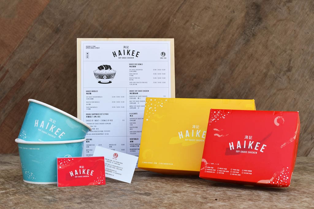
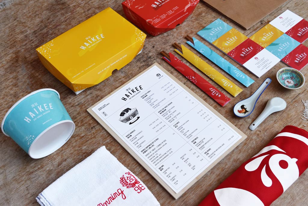
Haikee Soy Sauce Chicken
The key focus while developing the new identity was to create a brand personality that appeal to a younger audience, whilst retaining the brand’s long-established roots and values which older generations identify with… Taking the translation of HAIKEE (海记) to ‘sea journey’ – a direct reference to the founder’s voyage to Singapore in 1959 – as our point of departure, we incorporated subtle elements of the ocean and old Chinese seagoing vessels (junk ships) in the design of the chicken mascot.
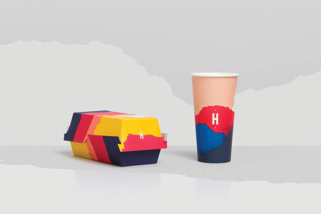
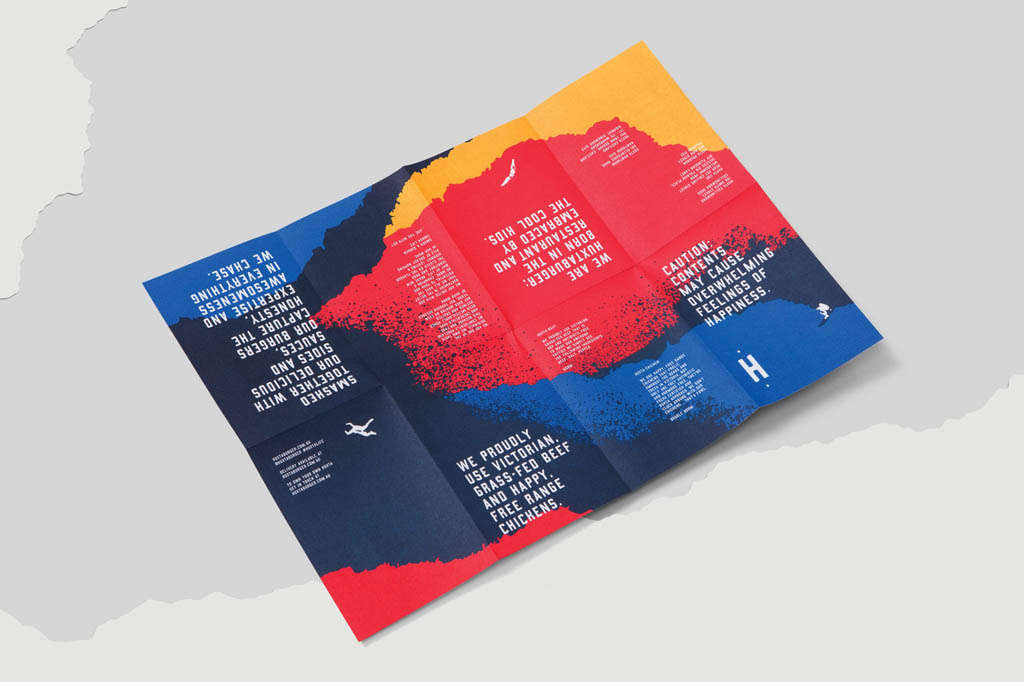
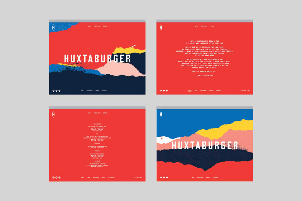
Huxtaburger
Graphic landscapes take inspiration from destinations in which Huxtaburger operate and also the visual look of the ingredients they use. The characters that you’ll discover throughout the visual identity embody Huxtaburger’s brand positioning by portraying people doing extreme things.
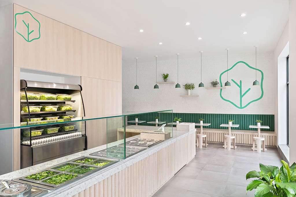
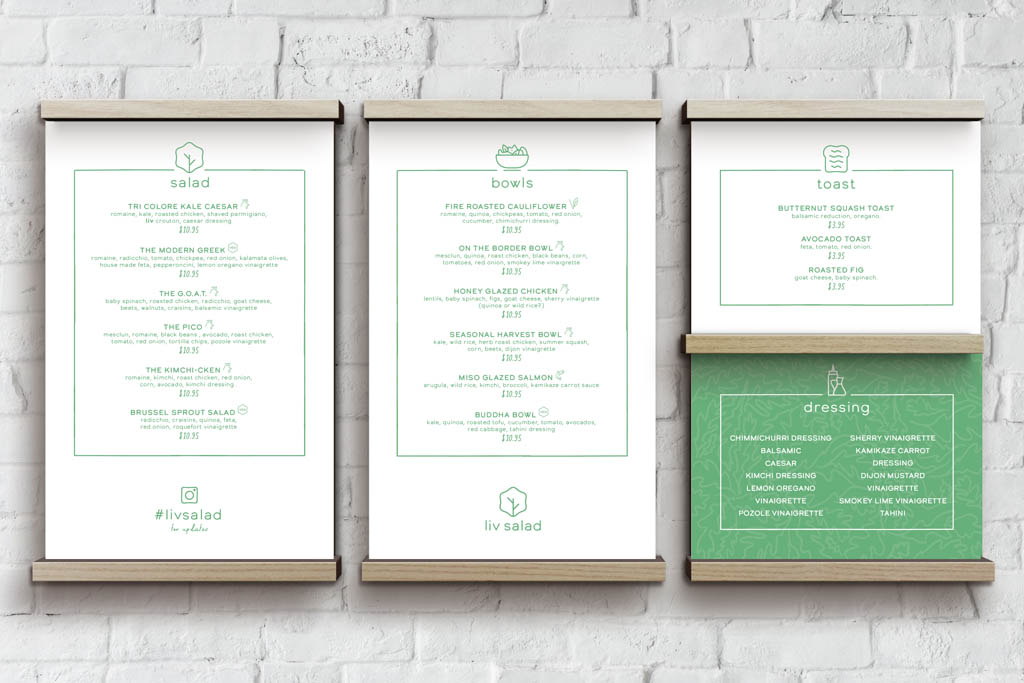
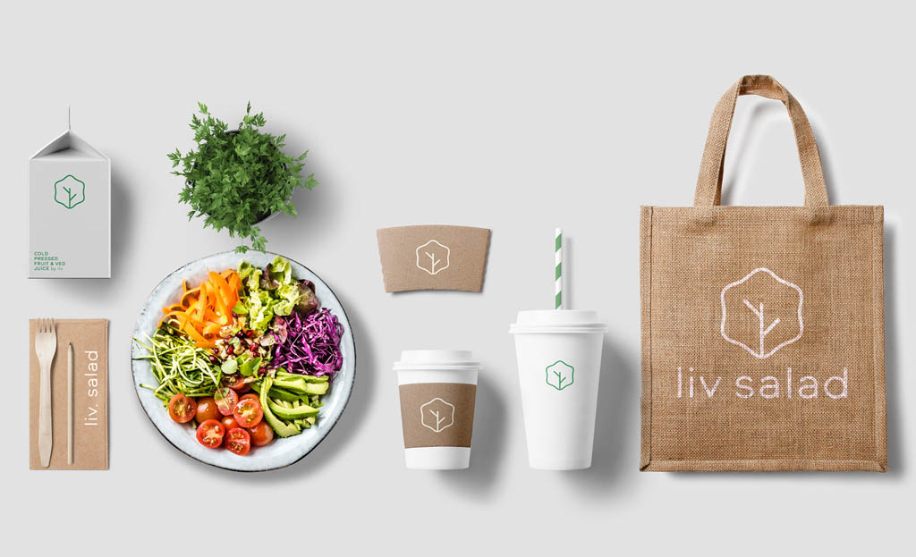
Liv Salad Bar in Queens, New York
Liv wanted an approachable brand, while also having a Manhattan “cool factor”. We explored various directions that pushed the envelope including playing with vibrant colours, leaf textures and watercolor art. But fresh minimalism helped communicate the health and quality of the product best! Along with simply designed compostable packaging in a bright open interior space, we could easily convey the brands values.
French Restaurant Brand Examples
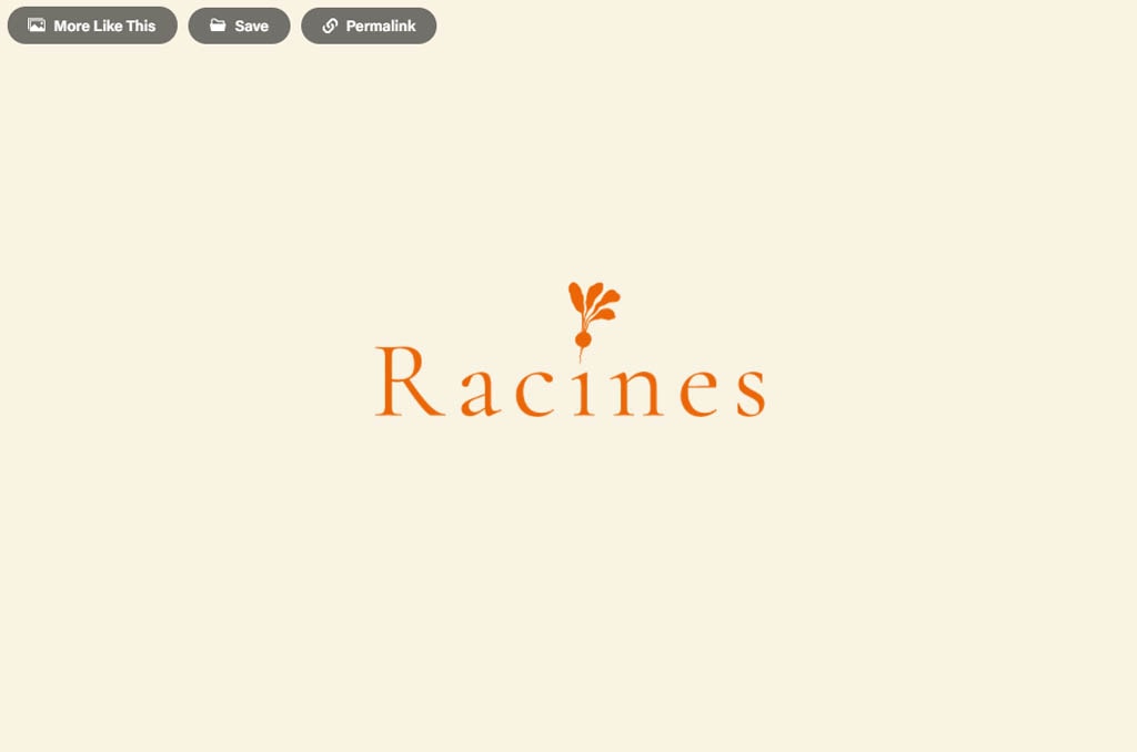
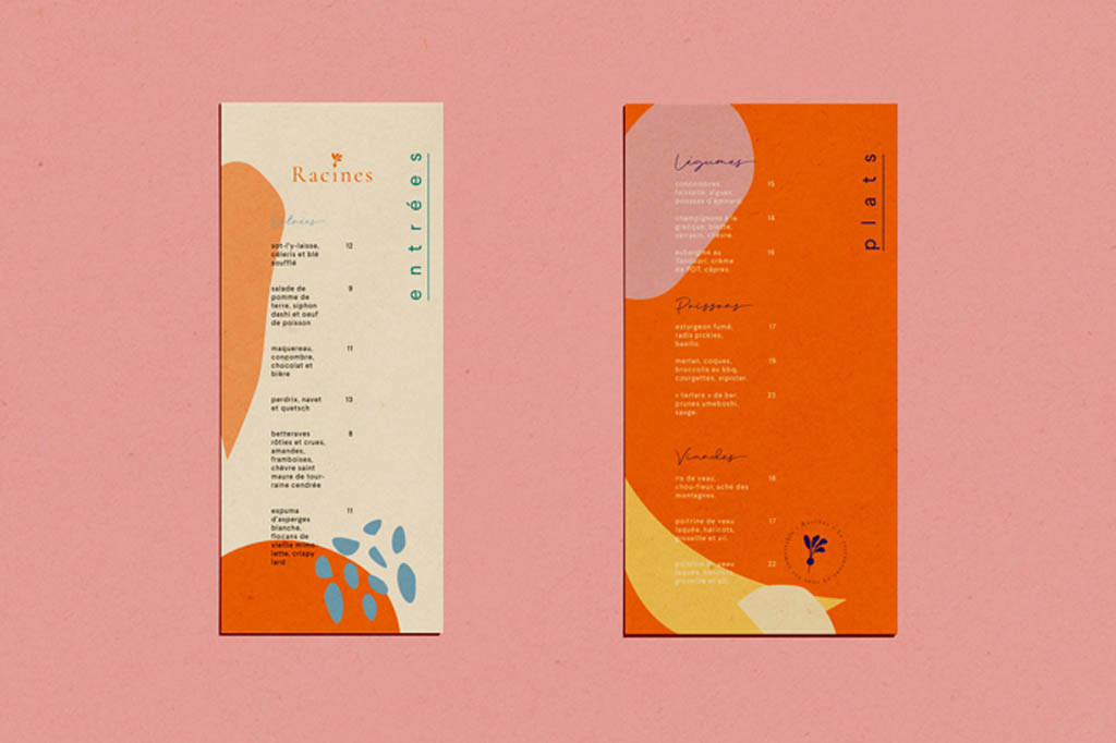
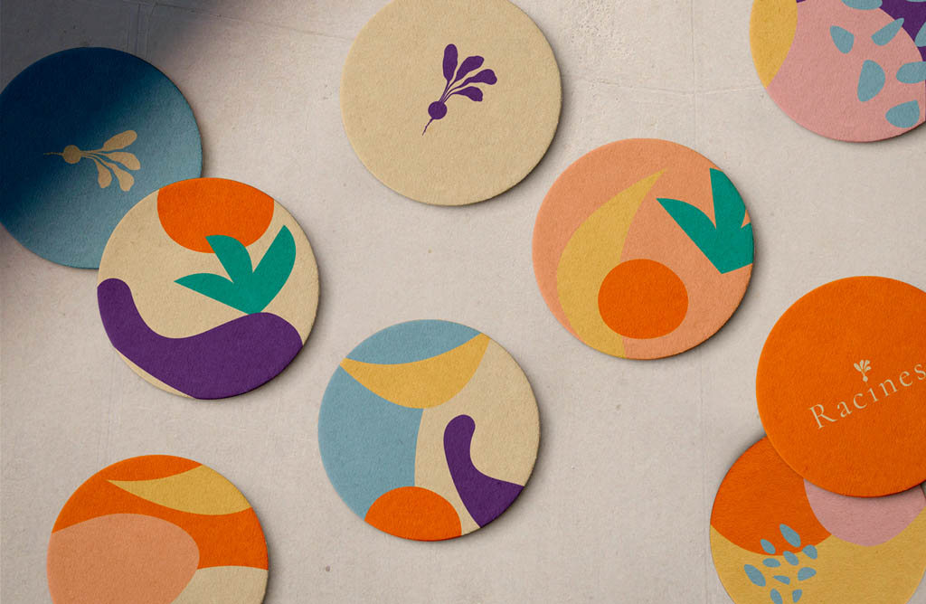
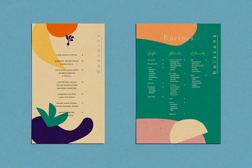
Restaurant Racines, Paris, France
Renard Petit Bistro
Renard Petit Bistro offers uncomplicated French cuisine recalling the Parisian bistros of the 30s. The name comes from the owner’s surname, which means fox in French. We were inspired by the color of this animal, as well as the shape of the building to create the logotype.
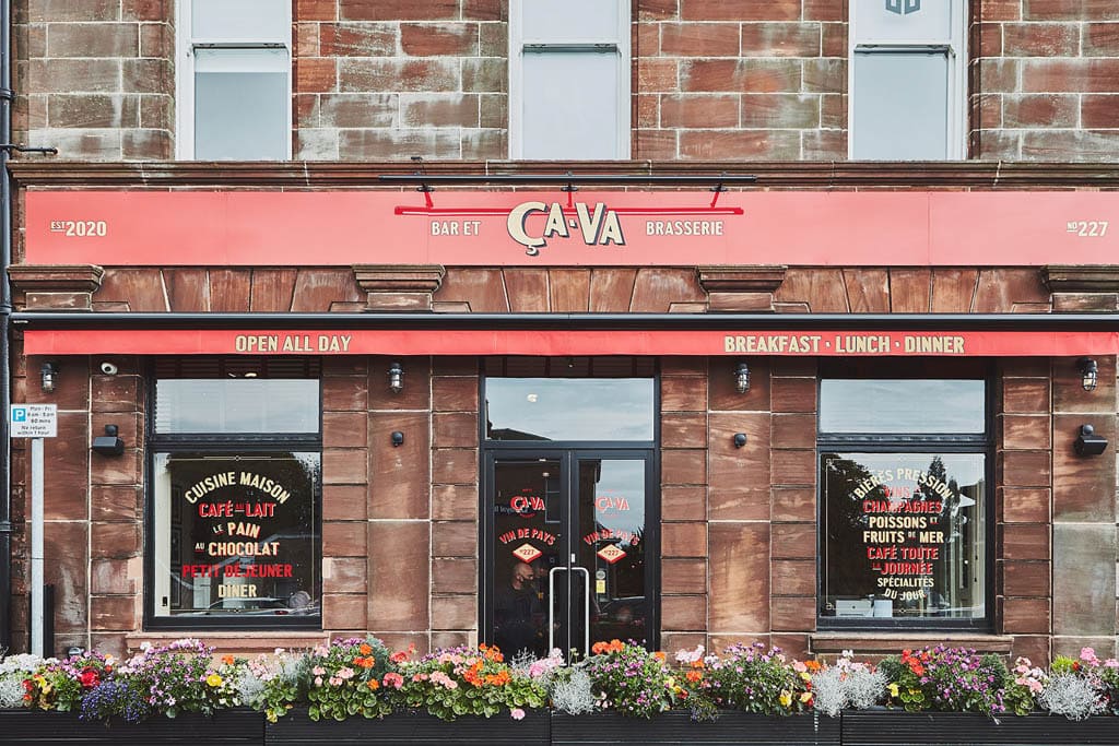
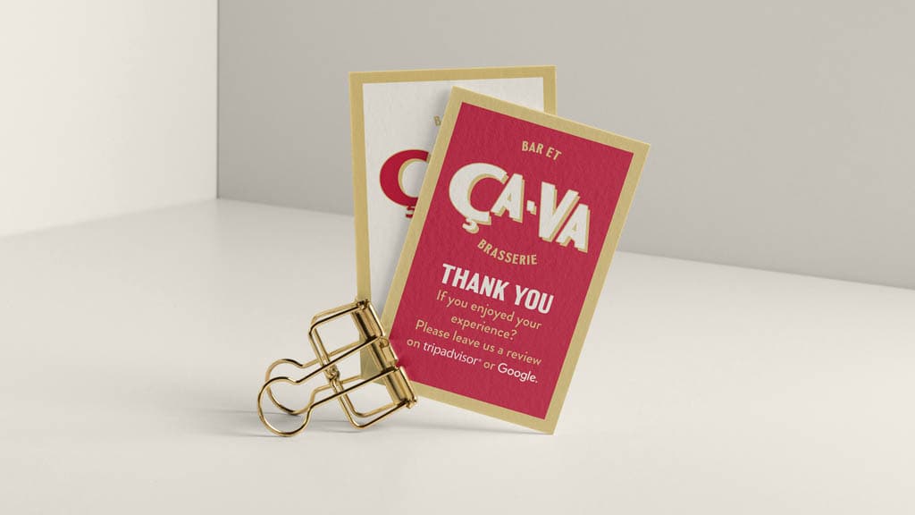
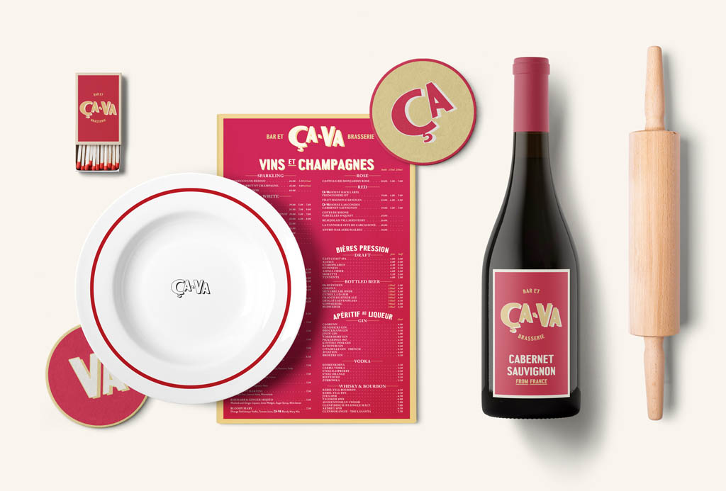
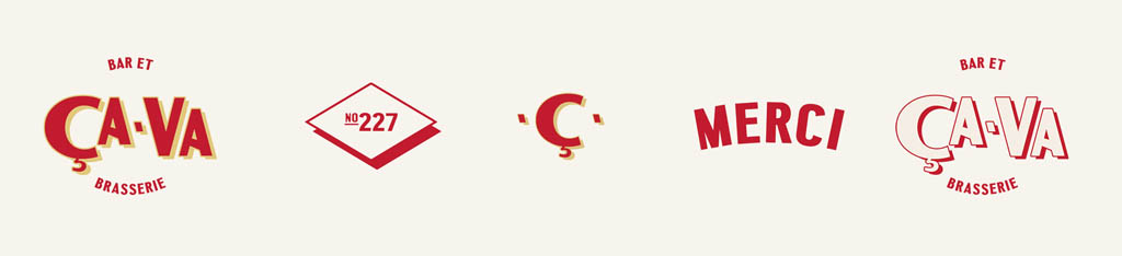
CaVa French Bar & Brasserie
We were heavily influenced by retro French café culture. Researching things like cigarette packaging, matchbooks from classic restaurants, and vintage posters. Helping us create an aesthetic that was bold and positive while communicating quality. Placing the restaurant as widely accessible, offering both classic french snacks and high-end dining throughout the day.
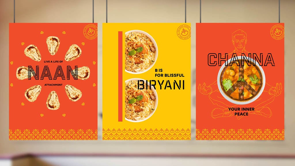
Indian Restaurant Branding Ideas
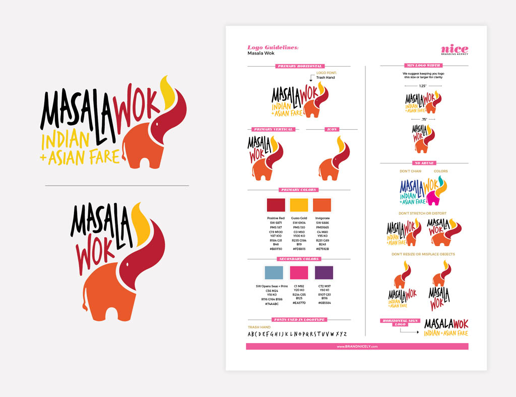
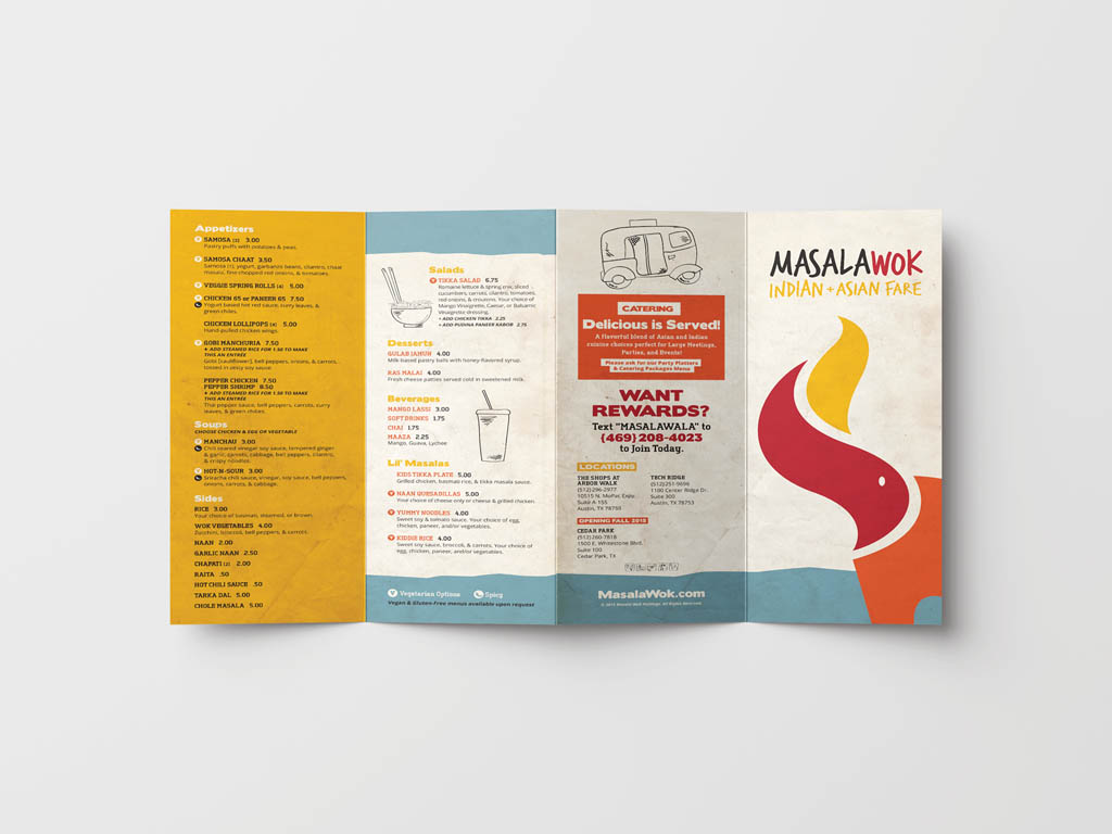
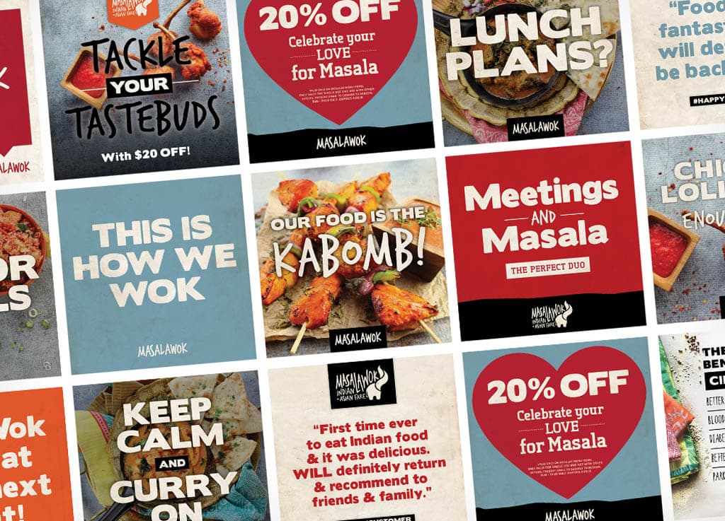
Masala Wok – Fast Casual Restaurant Rebranding
The third option featured a modern, playful design with an elephant, which represents Indian culture. The elephant’s trunk transforms into a flame, a nod to the preparation of Asian food in a wok. We assigned colors and icons to each of the cultures to distinguish India and Asia within the concept, yet weaved the cultures in a way that made sense for the brand and the new environment.
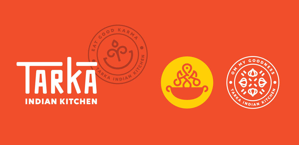
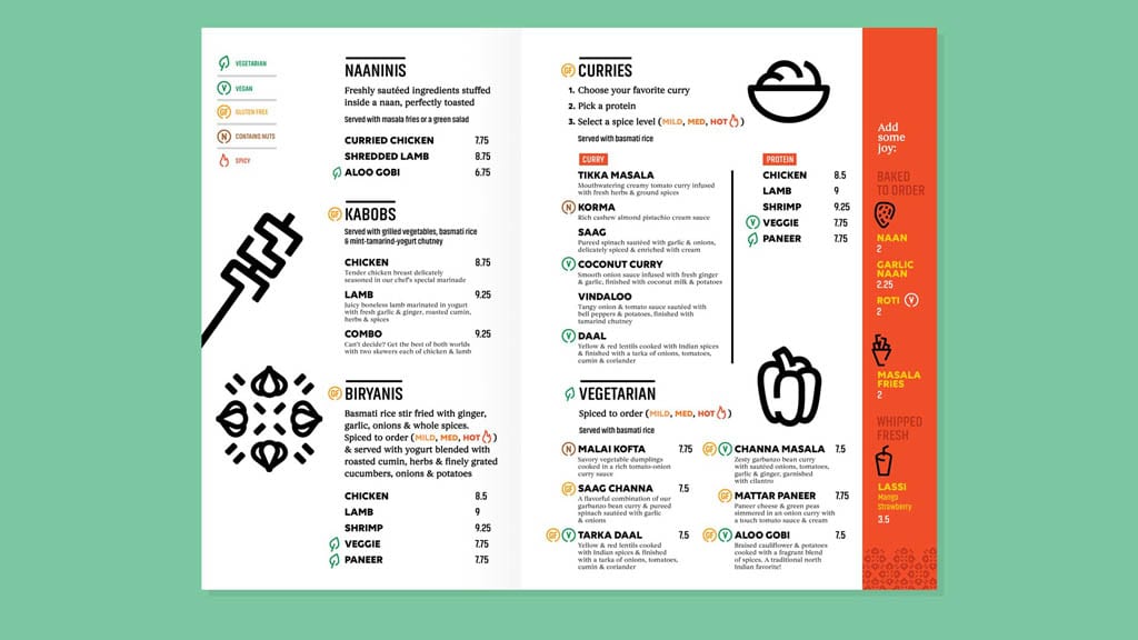
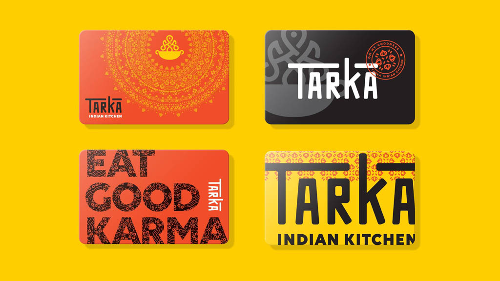
Tarka Indian Kitchen
The Tarka logo is a bold, yet simple type-driven mark, partially inspired by Hindu Sanskrit alphabet. To take advantage of the branded touchpoints throughout the restaurant experience, W|W designed a set of graphic seals to augment the visual library, as well as a custom icon set and related pattern work. The integrated branding extends thoughtfully through all points of customer engagement, from merchandising to social media to advertising, helping to define the emerging restaurant category and dispelling misperceptions about Indian dining.
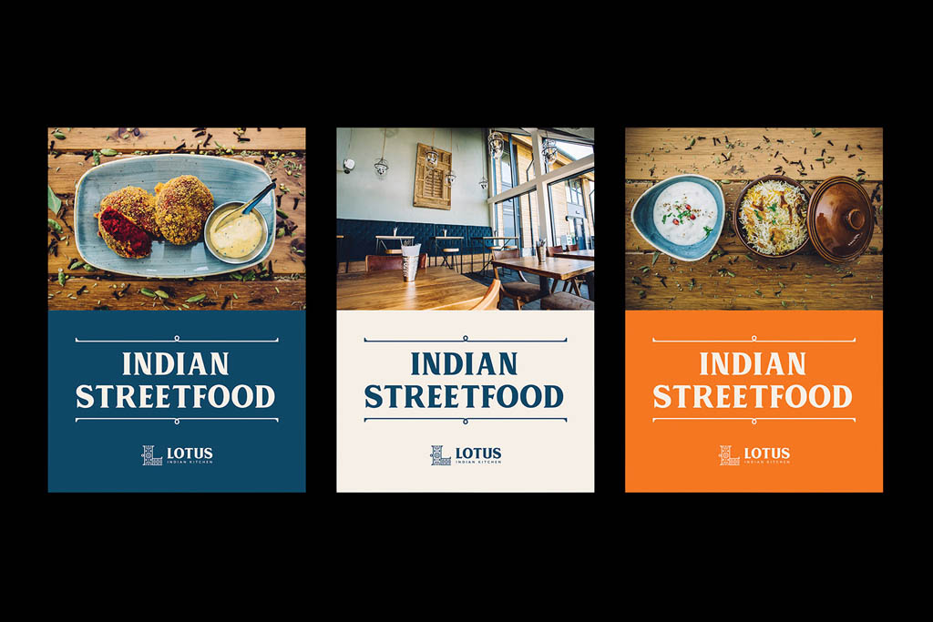
Lotus Indian Kitchen
Lotus Indian Kitchen serves authentic Indian street food, grills & curries. Set on scenic Mercia Marina (Derbyshire, UK), Lotus brings a fresh and relaxed approach to Indian dining. A modern visual identity, restaurant signage, menu designs, beer labels and further ongoing promotional print collateral were created as part of the brief.
Italian Restaurant Design
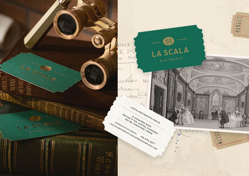
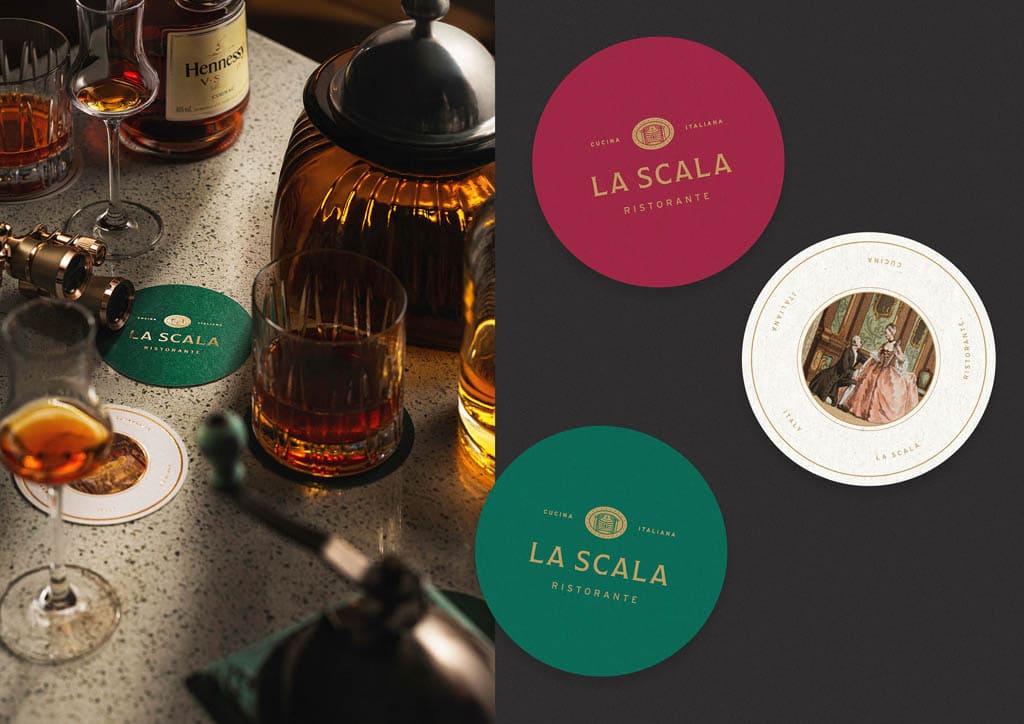
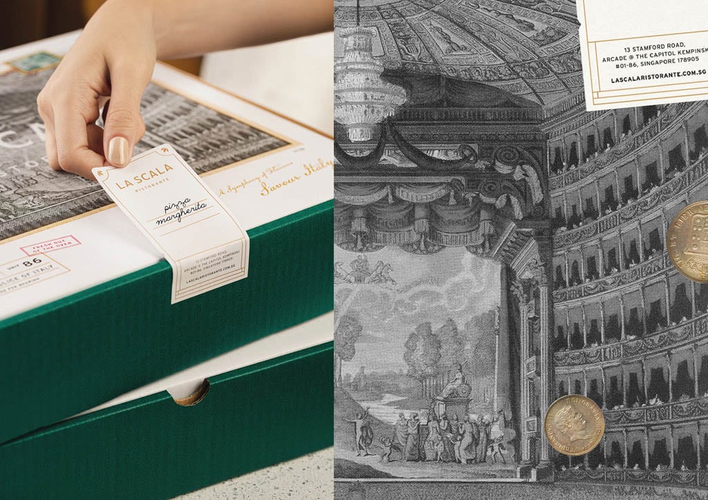
La Scala Ristorante
The stage is set for a mid-century feast with singing, dancing, and warm conversations all around. So turn back the clocks to the 1950s, and partake in the true culinary art in eating, laughing, and loving as you relive the golden years of long, long ago.
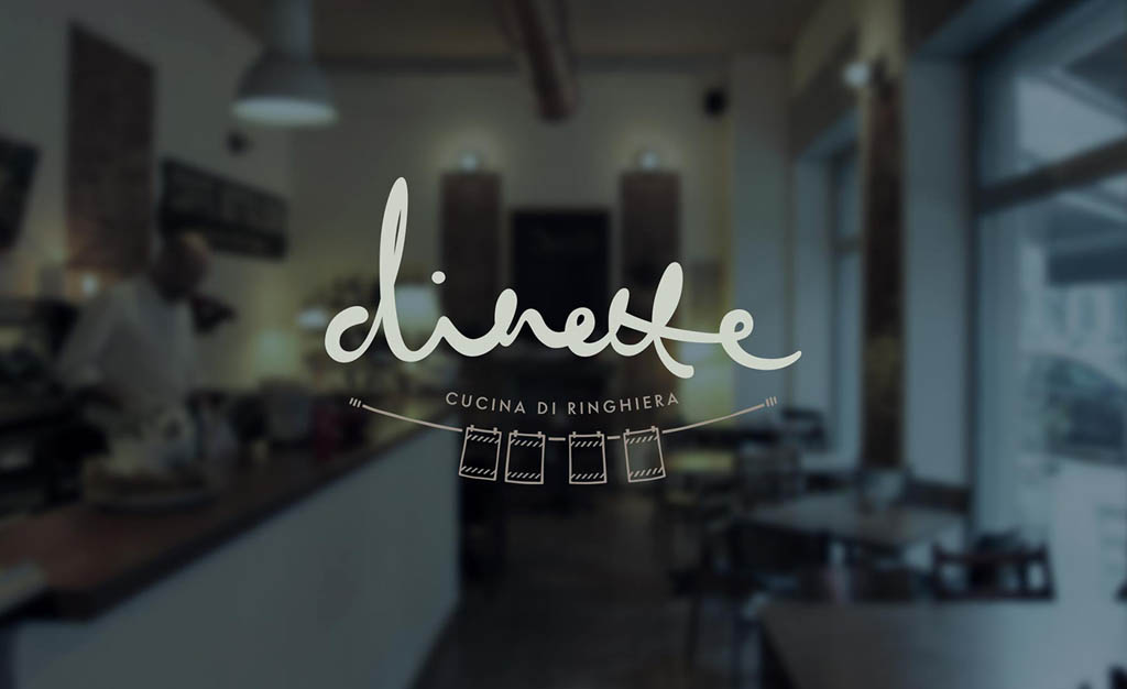
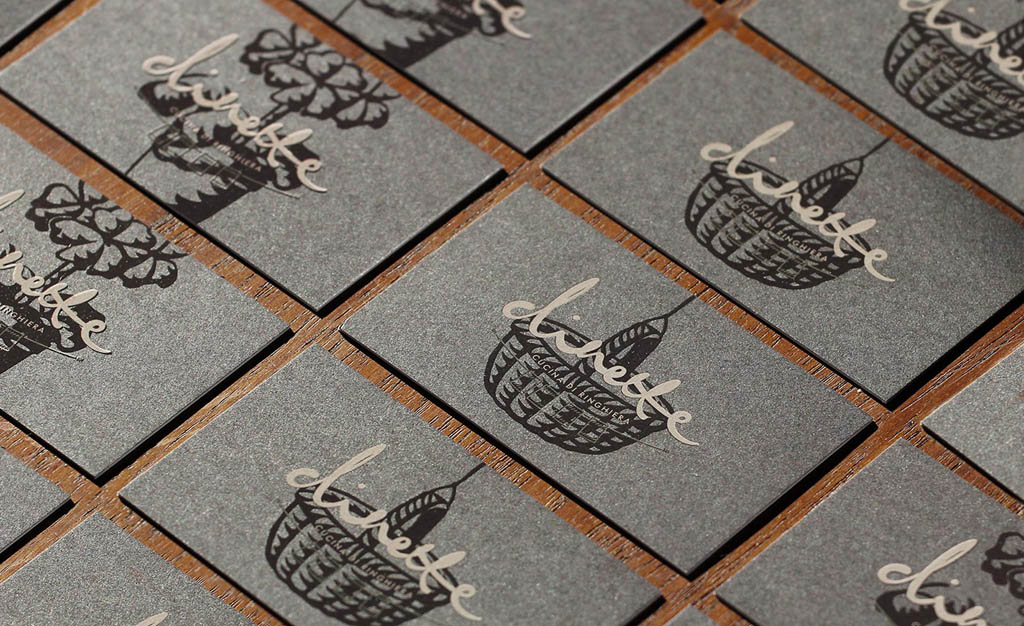
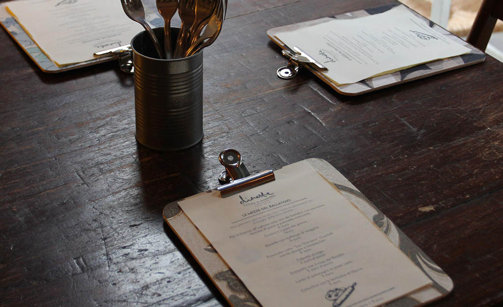
Dinette
Dinette is a restaurant in Milan. The tagline “Cucina di ringhiera refers to the typical Milanese apartments, connected by a single bannister, where everybody knows their neighbors’ kitchen and kitchen perfumes. For this reason we worked on a set of hand-drawn icons representing the world of banisters.
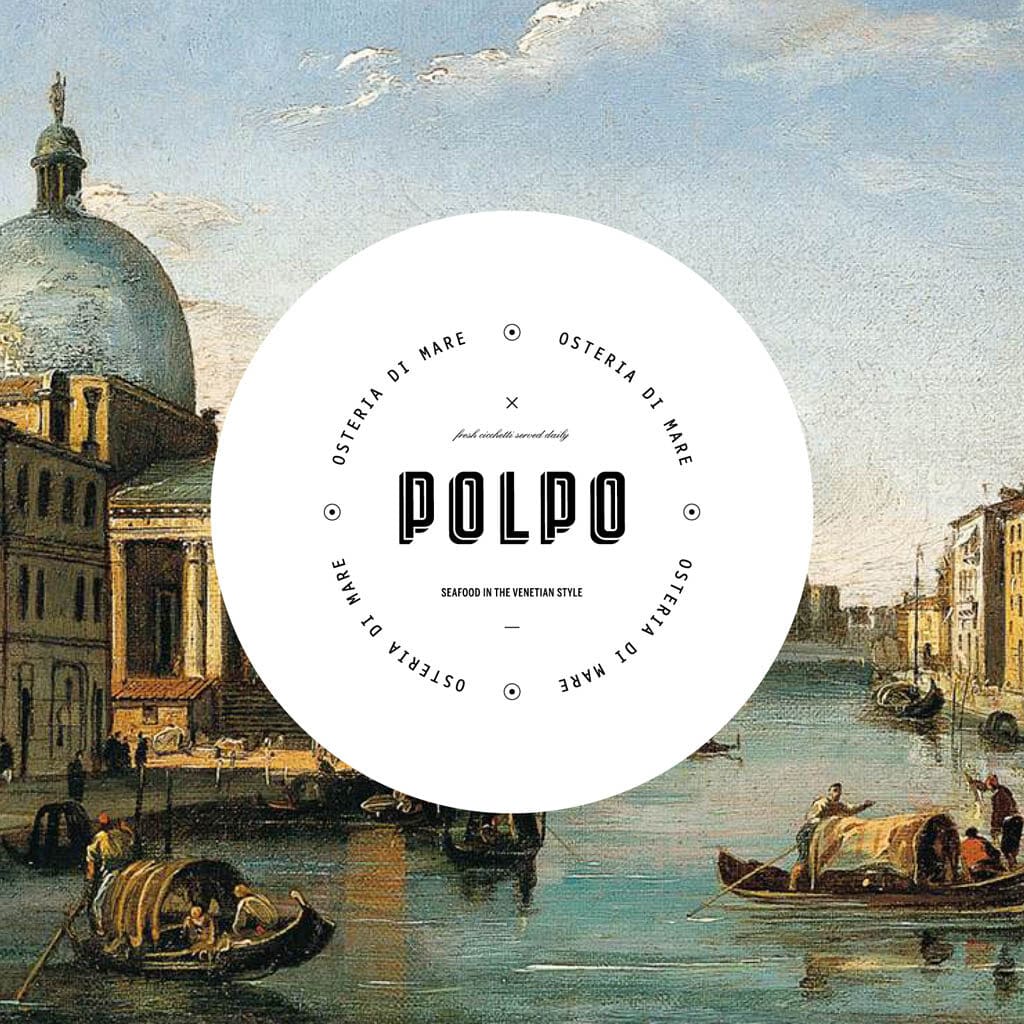
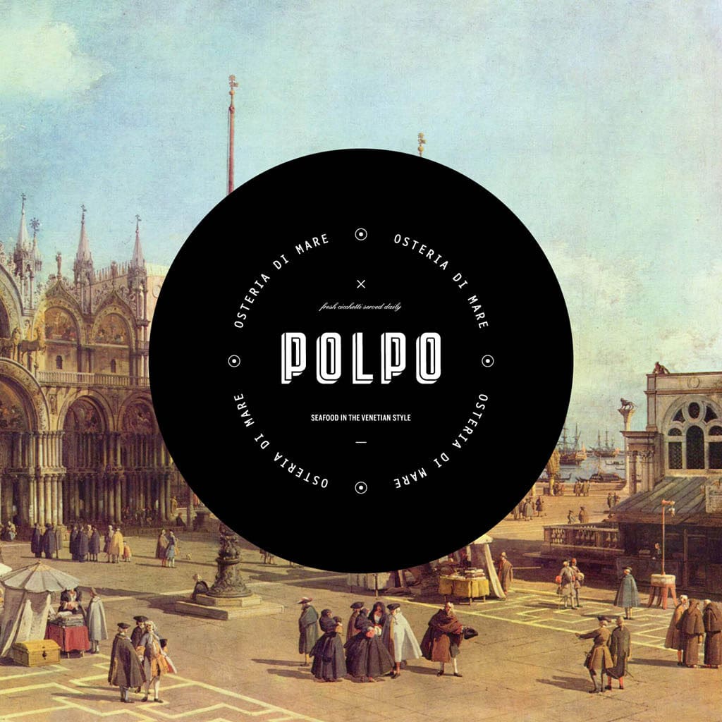
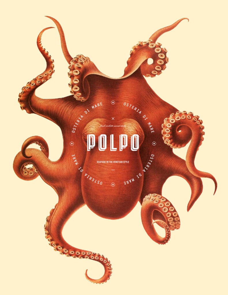
Polpo Restaurant
We created a name and a brand for a conceptual Italian restaurant that specializes in Venetian fare with a focus on seafood… Playing with historical images that were used in textbooks before the invention of photography created a playful image style in the context of this modern design.
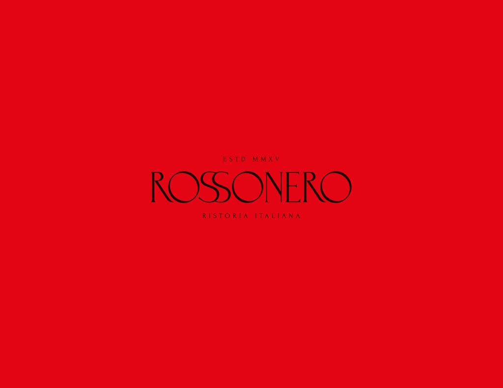
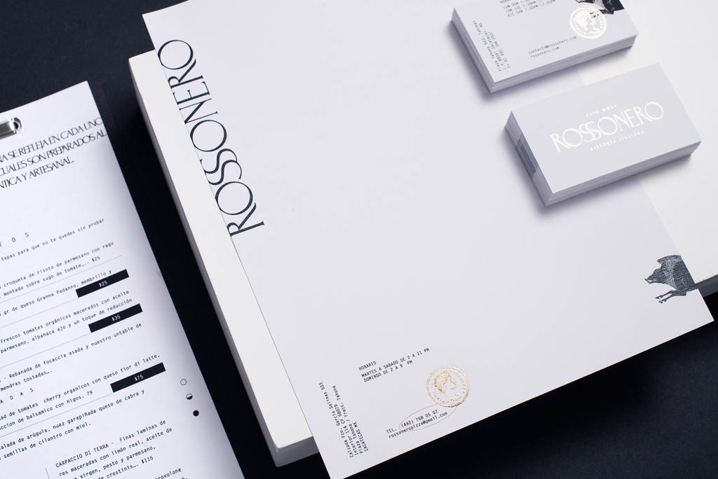
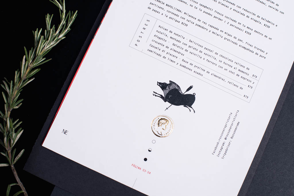
Rossonero
We wanted a refined graphic identity of the country of la Bota… We take as a reference the letters carved on a marble plate on Trajan’s column in Rome, as well as the coins that were sent to be engraved in Rome by Roman emperors, elements that we used as stamps and graphic aids in the menu and stationery.
Japanese Restaurant Branding & Design
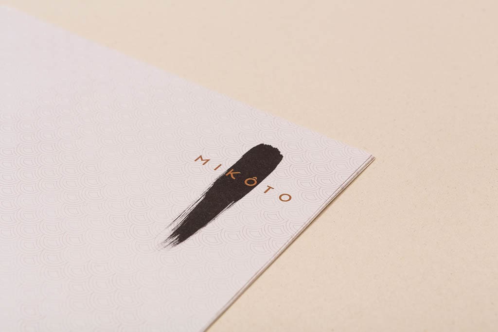
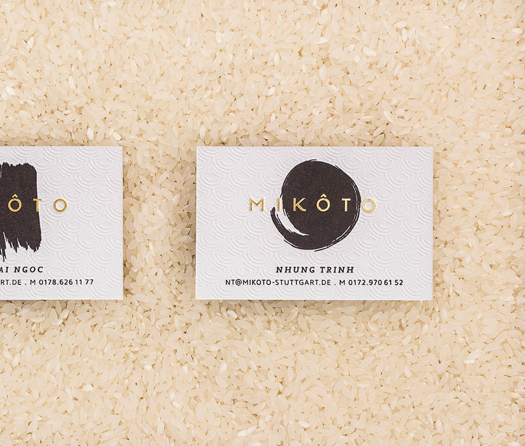
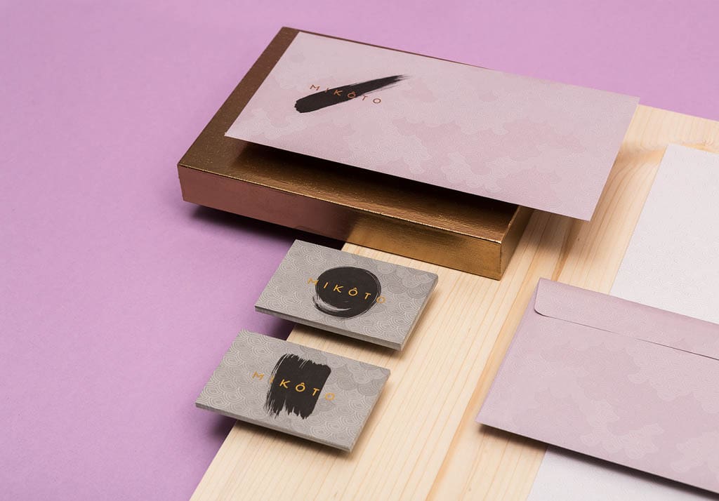
MIKÔTO Japanese Cuisine
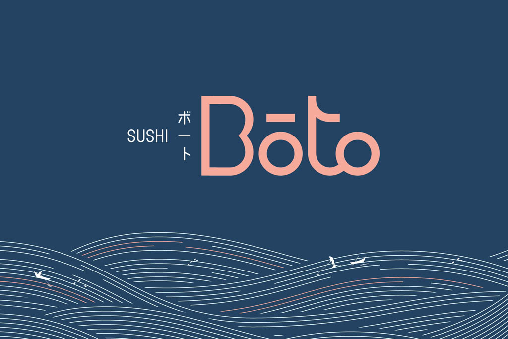
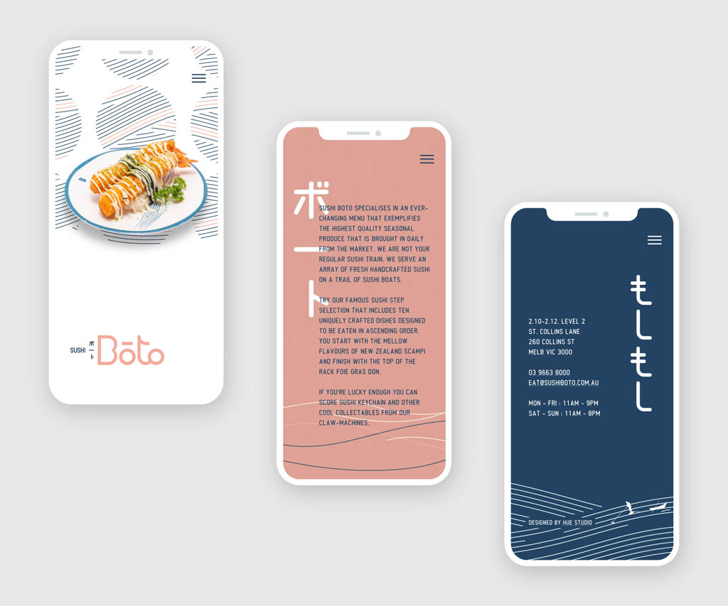
Sushi Boto
Sushi Boto is not your regular sushi train, it’s sushi boats on a gentle water stream and that’s how we came up with the name! We collaborated with Architects Eat whose responsible for their exquisite interior to capture the fun, quirky side of Sushi Boto into the whole branding.

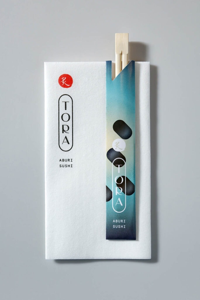
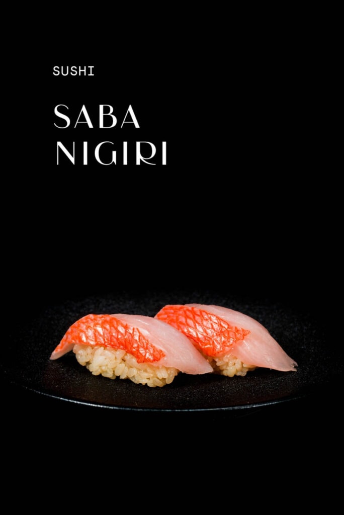
Aburi Tora
Sushi meets Technology
The design is inspired by the client’s positioning statement ‘Japanese tradition meets technology’, with the design of the interior referencing underwater themes and science fiction. Accompanying graphics, inspired by Japanese designer Koichi Sato and the blue hues, sweeping curves and textures of the interior design, were developed to reference the technology and underwater theme. All finished off the traditional ‘Aburi’ calligraphic stamp of the parent company.
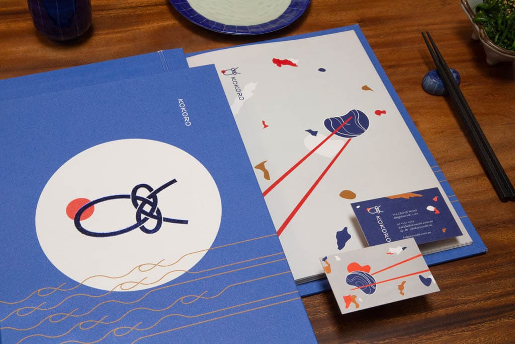
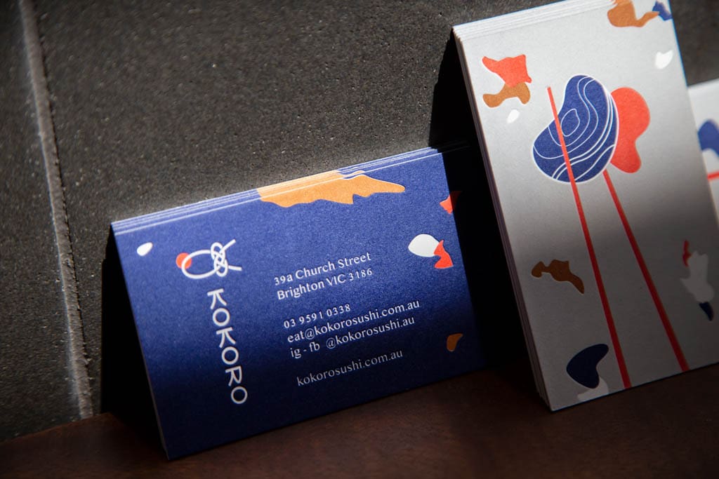
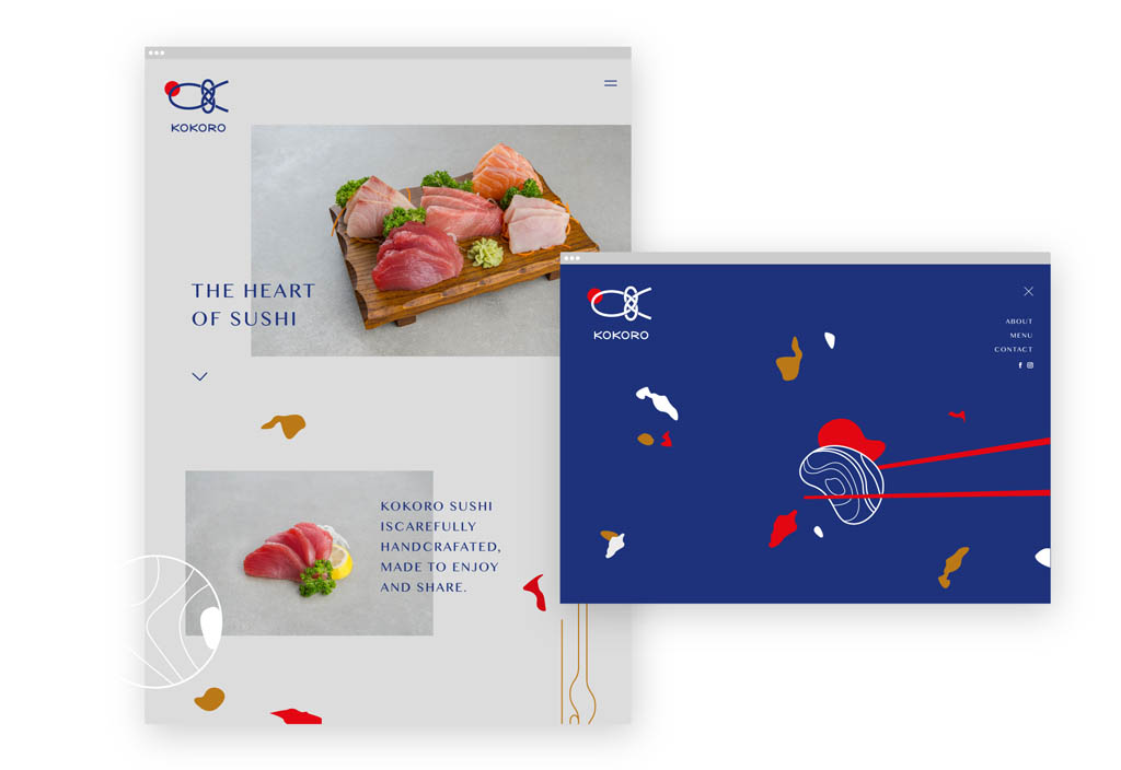
Kokoro Sushi
Kokoro Sushi is a traditional Japanese restaurant with a contemporary twist. The logo itself inspired from Mizuhiki, a traditional Japanese bow tie for wedding gifting to symbolise love and carefully crafted to reflect tuna fish and the initial K. We collaborated with MNE Architect whose responsible for the exquisite interior.
Mexican Restaurant Branding
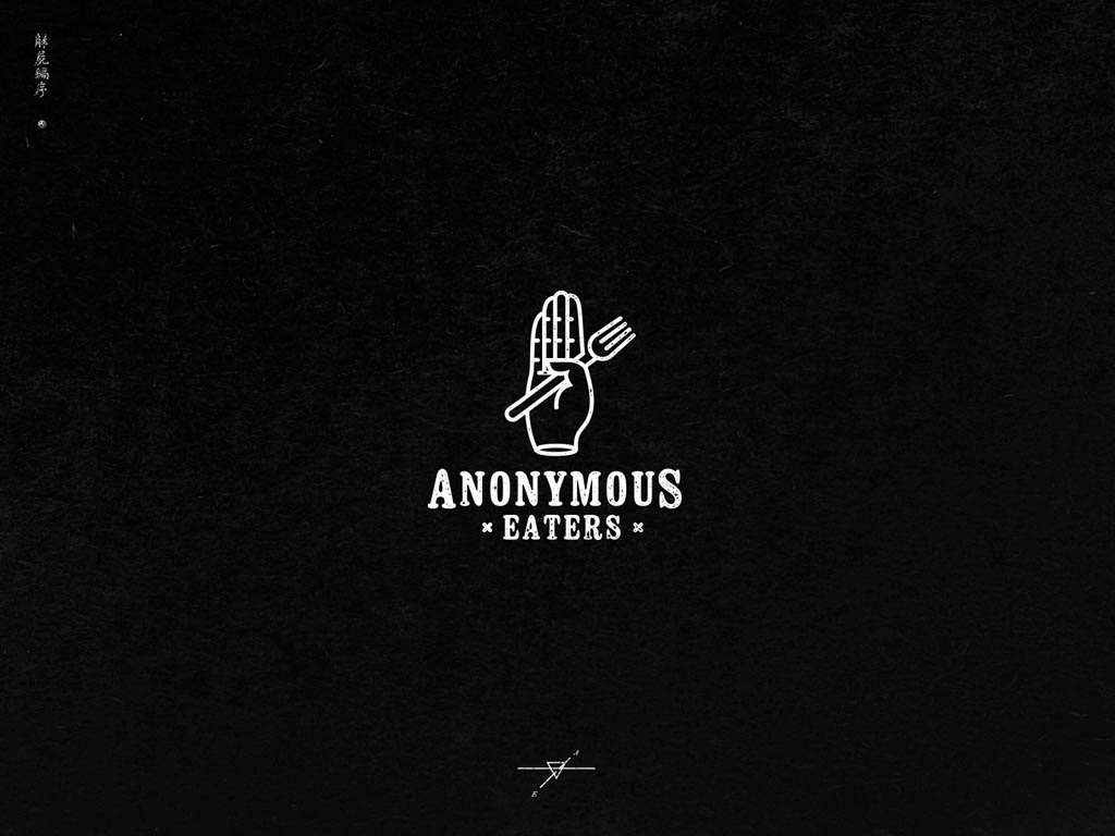
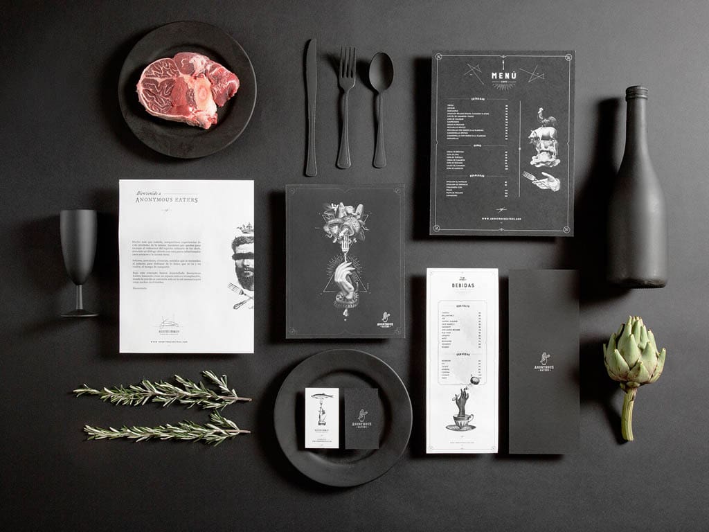
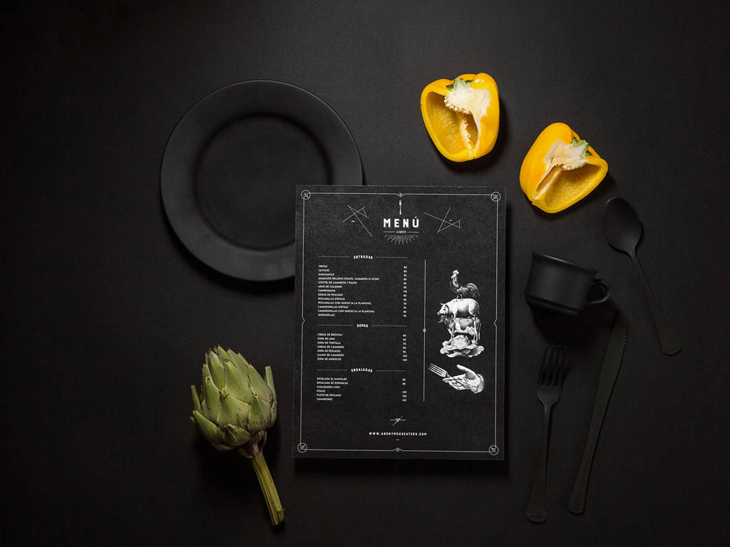
Anonymous Eaters
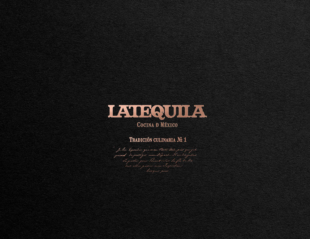
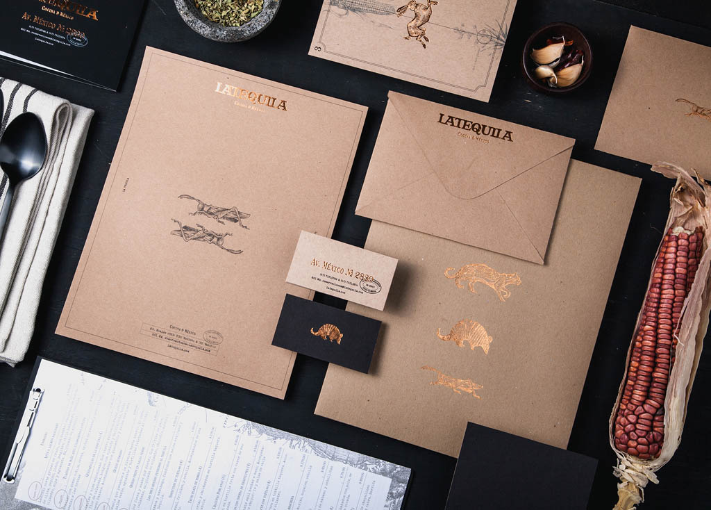
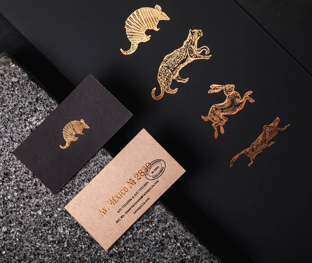
La Tequila Cocina de México
With this project, we look to graphically represent the best of Mexico. Our country is built by a union between our past and our present, a rich cultural heritage from our Pre-Hispanic roots, We used old engravings, typography, and visual elements with the purpose of fill the client with an experience of Mexico, mostly trough its gastronomy and unique and unforgettable flavors.
El Botín Mexican Restaurant
Meaning ‘The Loot’ in Spanish, El Botín aims to create a slightly quirky, uplifting vibe for their customers, where it’s okay (even encouraged!) to eat desserts for all 3 meals!
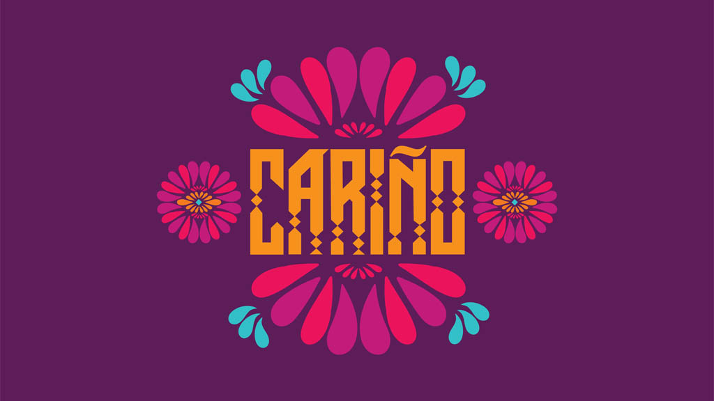
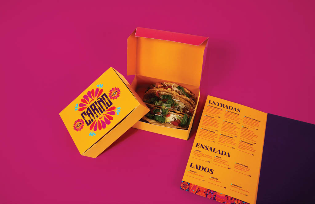
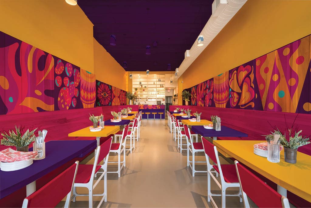
Carino – Mexican restaurant branding.
The identity has warm colors to represent ‘Carino’ which translates to ‘affection’. The goal was to take an emotion and cuisine and visually represent it in your branding and identity for a restaurant. The custom logotype is inspired by Aztec art and architecture. The logotype is accompanied by abstract vector illustrations that connect to form patterns. Each illustration represents a key part of Mexican traditions, cuisine, and culture.
Seafood Restaurant Branding
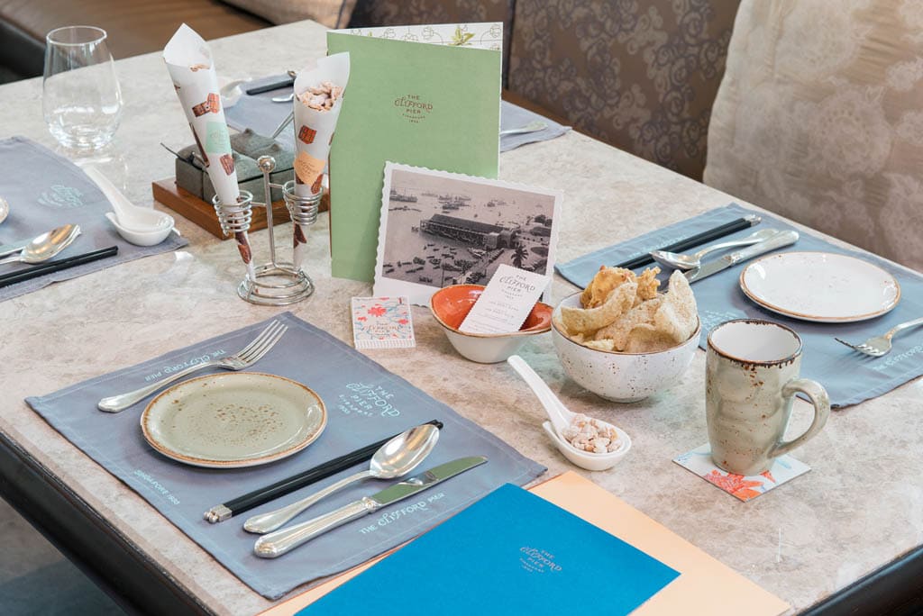
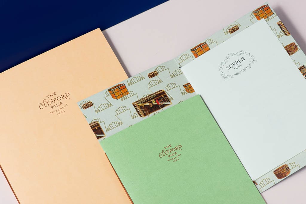
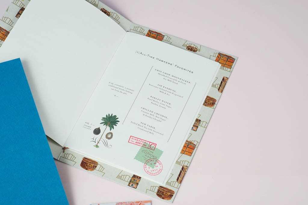
The Clifford Pier
Sharing an entity with its heritage, The Clifford Pier draws from its legacy as a bustling port in Singapore during the 1930s. Ginger flower motifs pay homage to William Farquhar who was fascinated with local botany during his time on the island. Collaterals with a color palette in sea-foam, coral, and Caspian blue; classic postage stamps accented with tropical flora and fauna, along with architectural elements, are reminiscent of the glorious voyages that set sail from this historical landmark.
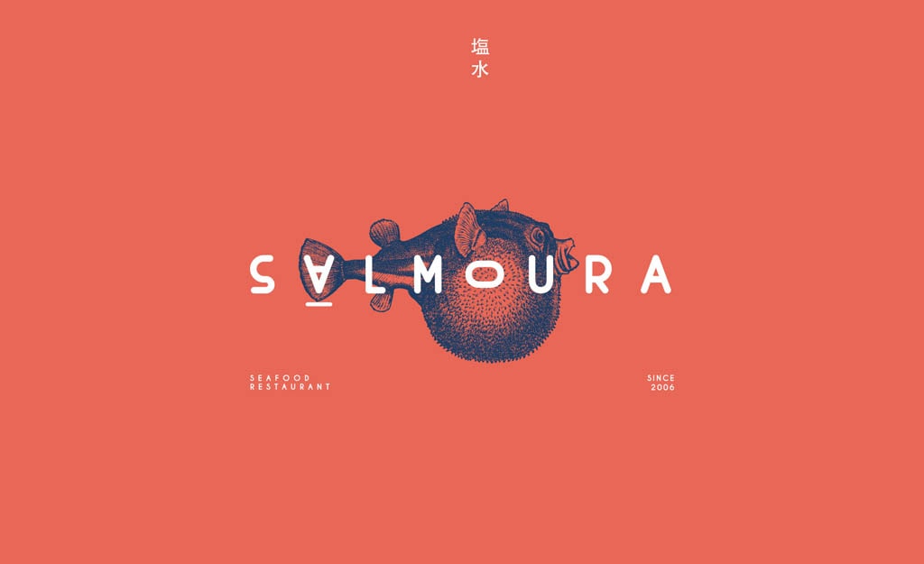
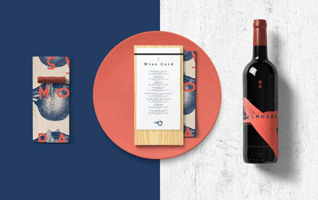
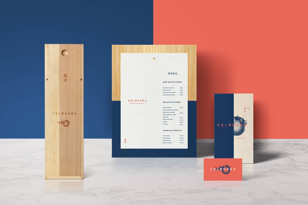
Salmoura
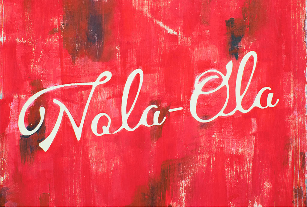
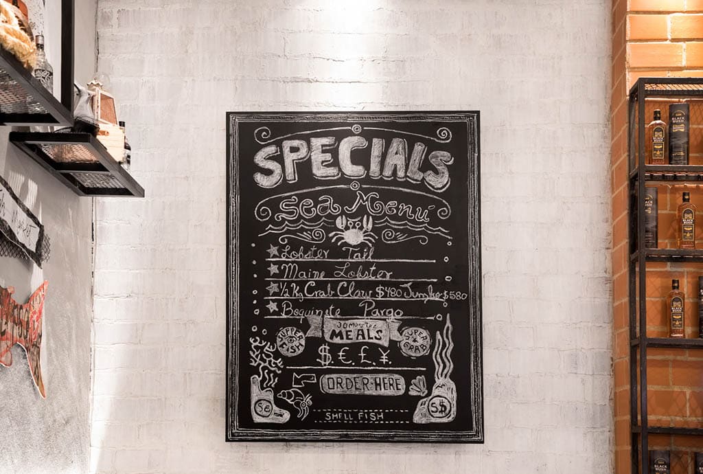
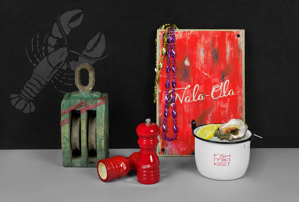
Nola Ola Fish Market
NOLA is the acronym for New Orleans, Louisiana; and it is the basis of our identity. Nola-Ola’s branding looks to immerse us in the full experience of the creole and seafood cuisine, in a casual, fun and relaxed environment, where the mixology also has an important place with classic cocktails like the Bloody Mary.
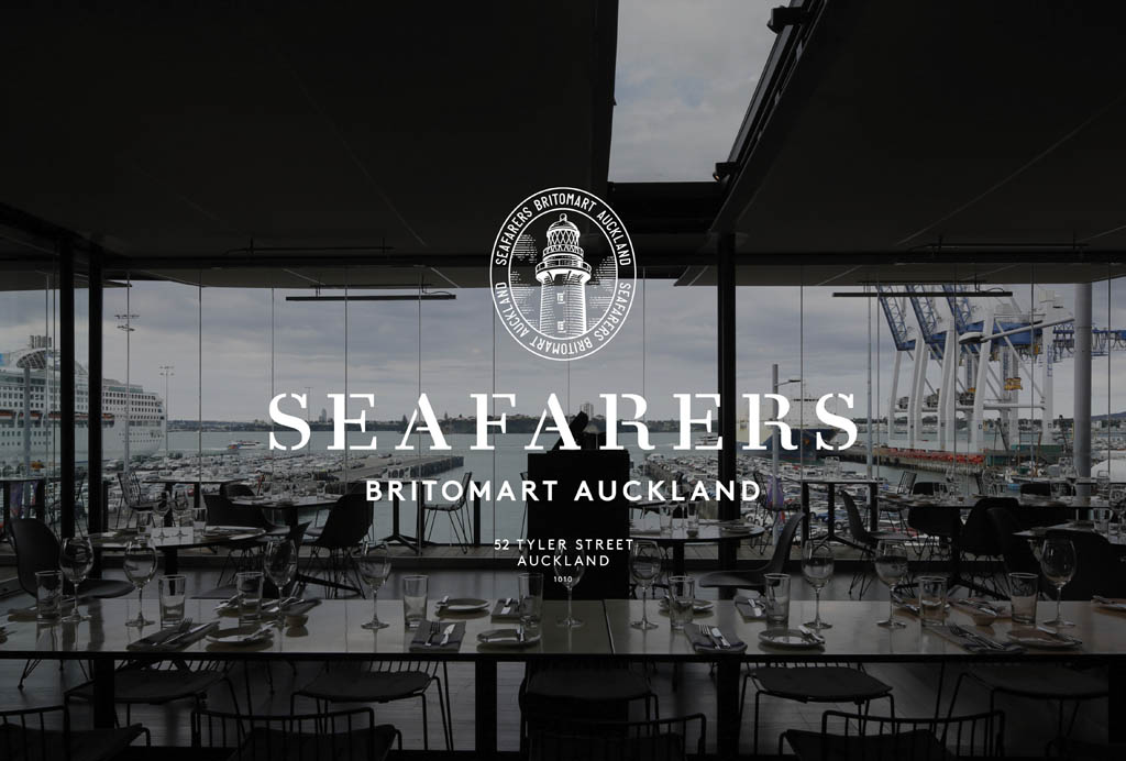
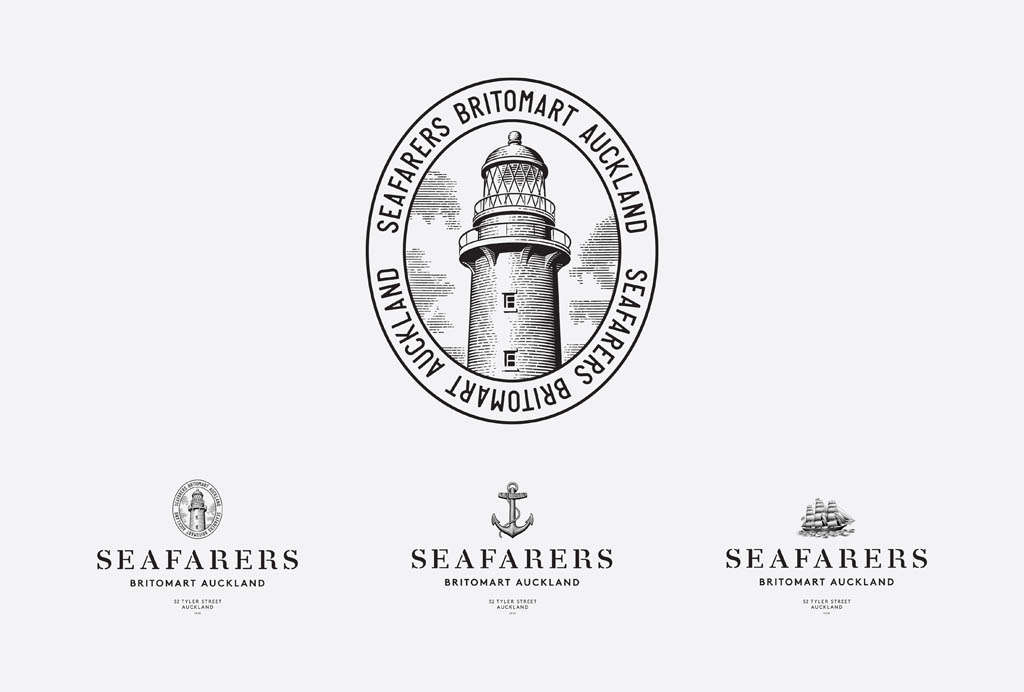
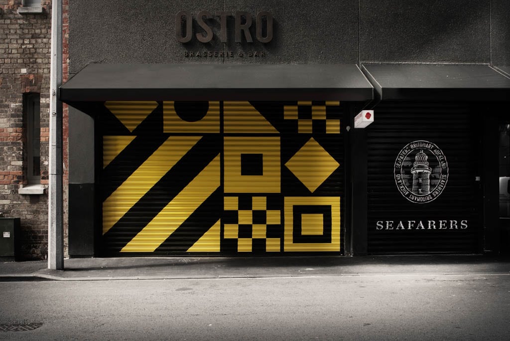
Seafarers / Ostro
An identity system for the Seafarers Building in Auckland. The building’s rich history as Auckland’s Sailors Home provided the basis of the nautical-themed branding which is applied through pattern and a limited color palette to many of the touch-points throughout the building — everything from elevator doors to House Rum.
Conclusion
If you want your restaurant to succeed, it’s not enough to have the best-tasting food or the best service. It’s not even enough to have both of those things — you’ll still need to offer something that makes your brand stand out from the competition in the form of a compelling restaurant branding strategy.
I hope this article has given you some inspiration for branding your restaurant business.
As a next step, I recommend you take a look at this post of best restaurant branding ideas.